
Accordion
Overview
Accordions are stacked headers that allow users to hide or view smaller blocks of content. Accordions are known as ExpansionPanels in Kendo.
Other names: Collapsible Panel, Collapsible Section, Expander, Expansion Panel
Behaviors
Focus
A focus state replaces the browser default focus state for accordions. The focus state is around the entire accordion — not just the icon and title.
Hover
The hover state is around the accordion header — not the entire accordion.
Disable
Accordions can be disabled. If disabled, the header has 50% opacity and can’t be interacted with at all. Disabled accordions are typically closed.
Animation
The animation between changing states should be 250ms, per our motion guidelines. The chevron arrow icon does not have a separate animation or visual change.
Content toggle
Selecting the accordion’s title toggles between collapsing and expanding the list of content. The chevron arrow icon is to the right of the accordion title.
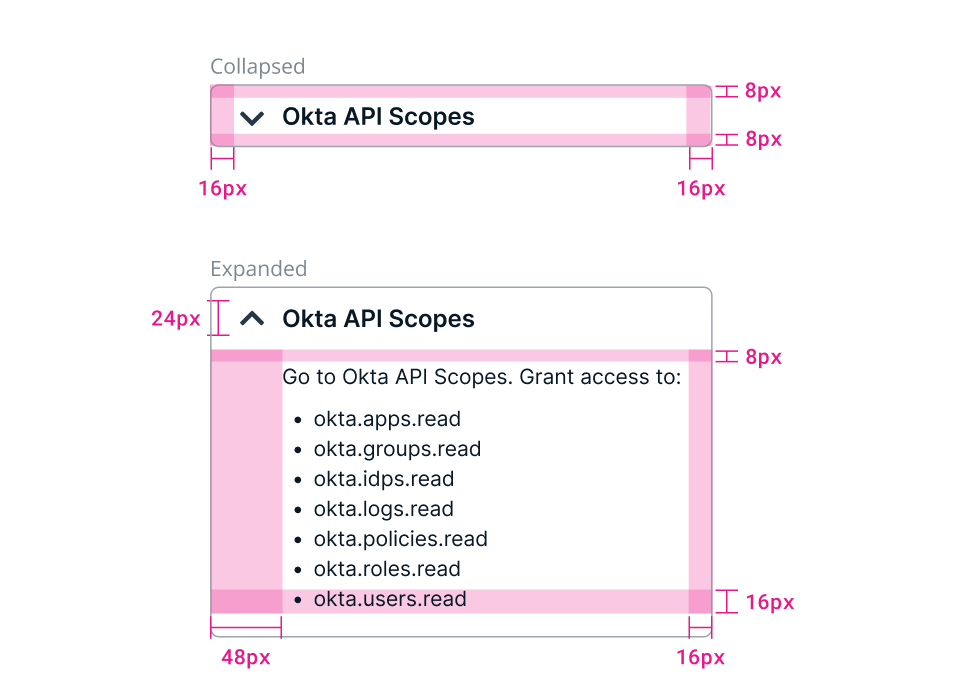
Example of a collapsed and an expanded accordion.
Collapse
Accordions are first displayed in a collapsed state to give users an overview of the content. When the accordion is collapsed, the list is hidden. The chevron arrow pointing down indicates collapsed.
Expand
When the accordion is expanded the list is visible. The chevron arrow pointing up indicates expanded. Users can expand multiple accordions at once.
Use full expand mode if the section has a limited height. Otherwise, use the single or multi-expand modes depending on use case.
Variations
Bordered accordion
An accordion with a border.
There’s a border around accordion headers when it’s collapsed and around the header and content when it’s expanded.
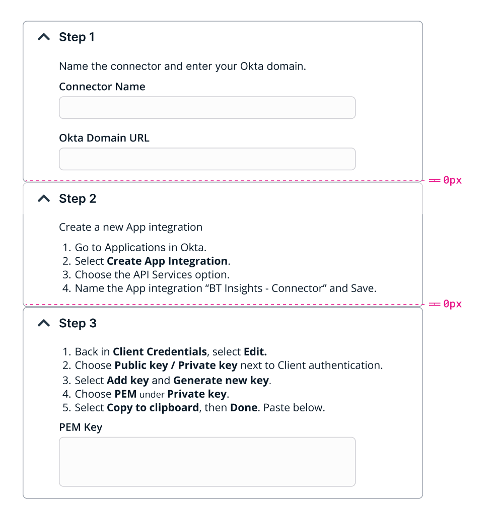
There is no space between the stacked accordions.
An example of a stacked, bordered accordion.
Borderless accordion
An accordion with no border.
There is a space between the stacked borderless accordions.
Example of a stacked, borderless accordion.
Usage guidelines
General
There are two expand/collapse patterns for pages with multiple accordions. One pattern has multiple accordions open at a time. The other pattern has only one accordion open at a time. Use one pattern or the other. Do not mix the patterns in a single view and try to be consistent about when each pattern is used across an application.
An accordion’s content shouldn’t extend past the accordion and should be fully hidden when closed.
Do not stack bordered and borderless accordions together.
Horizontal scrolling in accordions should be avoided.
Do use accordions: For content that’s not critical for a user to read For small blocks of content, but whole sections If there’s enough space to scroll vertically To split up a form
Don’t use accordions: If all the content on a page is necessary to read In place of panels (which can contain whole sections) To contain data grids, cards, panels or charts — data tables are fine To contain a form’s submission buttons — unless it’s a wizard
Content Guidelines
Accordion titles should be brief and specific. Aim for 3 or fewer words that clearly describe the accordion’s content.
Titles should be in sentence case.
Most content format can go inside accordions. Be careful to not confuse accordions with panels that can contain whole sections of an application. Do not use grids, cards, panels, or charting in an accordion. Data tables are fine.
Accordions can be used to split up a form, but should not contain the form’s submission buttons. Wizards are an exception, as they may have an entire step in an accordion that includes the submission buttons.
Position
Accordions can be on the main section of a page, or inside a side panel or tile. An accordion can, but does not have to, fill its container. There is no minimum or maximum height or width of an accordion.
Related
Referenced in this section:
Updated about 2 months ago