
Radio Button
Overview
Radio buttons let a user pick one choice from a list of options.
Other names: Radio, Radio Group
Behaviors
Focus
A focus state replaces the browser default focus state for radio buttons.
Disable
Disabling a radio button or radio button group removes the hover state and click events. Disabled radio buttons have an opacity of 50% on both the indicator and the label.
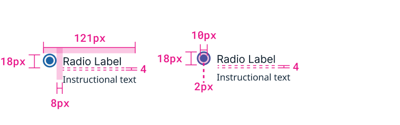
Instructional text
Instructional text can appear below the radio button label. It should not be italicized as italic font is not readable.

Example of radio button with label and instructional text.
Usage guidelines
General
Example of selected radio button with label.
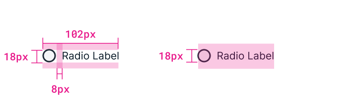
Example of unselected radio button with label.
Do:
- Use radio buttons when users need to make a single, mutually exclusive choice.
- Have a radio button selected by default for a radio button group.
- Use 2 or more radio buttons.
Don't:
- Use radio buttons when users can select more than one option, use checkboxes instead.
Content guidelines
Radio buttons should be listed after a colon or a header that makes it clear to the user they're required to make a choice.
Try thisChoose the account:
- Personal
- Shared
or
Account Options:
- Personal
- Shared
Not this
- Personal
- Shared
Radio buttons shouldn’t use punctuation like periods, parentheses, or colons. If needed, a dash can be used to add a definition or further context.
Try thisChoose the account:
- Personal — only you can access
- Shared — everyone can access
Not this
- Personal; (only you can access).
- Shared; (everyone can access).
Radio buttons can be in title case if they are only a few words. Anything longer should be sentence case.
Try thisChoose the account:
- Personal Account
- Shared Account
or
Account Options:
- Personal — only you can access
- Shared — everyone can access
Not thisChoose the account:
- personal account
- shared account
or
Account Options:
- Personal — Only You Can Access
- Shared — Everyone Can Access
Radio buttons can also use instructional text and tooltips to add additional definitions or explanations. Help text and tooltips should add extra value — they shouldn’t just repeat what the radio button label says. Instructional text appears below the label.
Try thisLabel: Associate with Smart Rule Help text: Smart Rules are ways to organize assets.
Not thisLabel: Associate with Smart Rule Help text: The application will be associated with a Smart Rule.
Radio buttons can also contain text fields and drop-downs that allow users to enter a selection. If a user enters content in a field that is not currently selected, that radio button automatically becomes selected.
Position
Radio buttons should typically be vertically stacked with each button on its own line. If the labels are short and there are only 2-3 buttons, they can be horizontal and on a single line to save space.
Related
Referenced in this section: Checkbox component
Updated 8 days ago