
Button Group
Overview
Button groups let users perform similar actions from a collection of buttons.
Other names: Toolbar, Button Bar
Behaviors
Select
Button groups have one button selected by default and only one can be selected at a time.
Focus
A focus state replaces the browser default focus state for button groups.
Disable
Disabled buttons have a 50% opacity. Any combination of buttons in a button group can be disabled.
Variations
Default
Buttons in a button group contain just a label by default.
Button with icon
Any number of buttons in the button group can have an icon to the left of the label. These icons can be logos, which can use their own brand colors and are exempt from accessibility contrast rules. If the icons are not logos, they follow the same color standards as the icon component.
Usage guidelines
Content guidelines
The content guidance for button groups is the same as the guidance for buttons.
Also, try to label all the buttons in a group consistently so that they feel thematically linked. The relationship between the buttons should be clear and the text should follow a pattern. For example, use just nouns to label every button, or a verb and a noun for each—not a combination of both options.
Try this
- Favorites
- Recently Used
- Systems
- Databases
Not this
- My Favorites
- Go to Recently Used
- View Systems
- Databases
Wrapping
Try to avoid button groups wrapping whenever possible, so limit the number of buttons in a group. Button groups wrap by starting a new row of buttons just below the first row with a small gap between them.
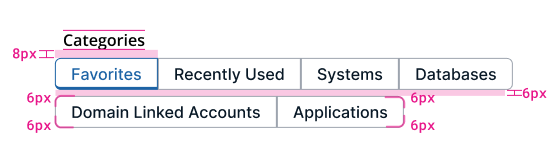
Example of button group wrapping under a section header and corner radius dimensions.
Button groups or tabs
While tabs and button groups behave mostly the same, each has a specific use case.
Use button groups:
- To filter content that’s mostly the same
- If your interface has the same or similar arrangements and components
For example, each button displays a specific type of data in a grid.
Use tabs:
- To organize content that’s distinctly different
- If your interface is particularly complex
For example, one tab contains a group of labels and values, another tab contains a data grid, and another contains a form.
Size
Buttons in a group aren't all the same size.
Related
Referenced in this section:
Button component
Components and patterns that use button groups:
Updated 8 days ago