
Text Link
Overview
Text links take users to another place in or outside of the application. Text links act as references or directions to an external or internal resource.
Other names: Link, Anchor, Hyperlink
Behaviors
Focus
A focus state replaces the browser default focus state for text links.
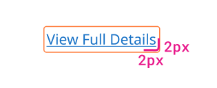
Example of text link focus state.
Visited
Our applications don't use a visited state for text links. Websites use them as a helpful indicator to show when you've already visited a page, but users in applications don't use links as regularly.
Usage guidelines
General use
Text links are commonly used for the following purposes:
- Navigating to an external or internal page
- Performing some type of action
- Directing users to another area in the product or system, like a form field
Content guidelines
Text links need to be clear about where they'll take the user. The link itself should be 3 or fewer words.
Try thisLearn more about Password Management.
Not this
Text links can be title case when they're standalone and only a few words. Text links should not be capitalized when they're part of a sentence unless they're a proper noun.
Try this
- Contact Administrator
- If you'd like help setting up an API account, read our guidelines.
Not this
- Contact Your Administrator To Learn More
- If you'd like help setting up an API account, Read Our Guidelines.
Position
Standalone text links are by themselves, usually directly after a piece of content. Standalone links shouldn't be so long that they wrap.
Inline text links are inside a paragraph or sentence.
Text links with icons
Adding an icon to a text link can help users to understand its purpose. External links can have a “pop-out” icon to show that it will take the user out of the application.
Text link icons are smaller than regular icons (no bigger than 16px by 16px) to match the text they're paired with. Icons are to the right of the text link.
Related
Referenced in this section:
Components and patterns that use text links:
Updated 8 days ago