
Icons
Overview
Icons are small symbols that represent actions and items. Icons help users complete tasks by giving them visual cues. Icons are different from illustrations, which are larger and more detailed.
Principles
Less is more. Do use icons meaningfully, but don’t rely on icons to communicate or use them for decoration. When there are too many icons on a UI it can become cluttered. Try using a single icon to capture a group of items, instead of a different icon for each item on a list.
When designing new icons, do aim for simplicity, don’t be over detailed.
Be literal, not abstract. Icons work best when they mirror real world objects. That’s why magnifying glasses are recognizable as search icons, or why hour glasses signal waiting. If someone needs to think about what an icon is or why it’s there, it isn’t the right icon.
Consistency is key. Icons are effective when they reduce cognitive load — the effort it takes to process and retain information. Using different icons to symbolize the same thing across multiple products is confusing and adds to the load. Inconsistency forces our users to understand and remember an icon’s meaning and purpose.
Do use the same icons for every product and every interface. Don’t use too many variations of the same icon.
Do use standard and instantly recognizable icons, like a gear for settings. This is an example of a universal icon that always means the same thing, or a house to navigate home. You don’t need to design new icons where an existing one will work just fine.
Directional icons are also universal, like an x for Close or left-pointing arrow for Back.
Icons and text
Icons should nearly always be accompanied by a title or label so their meaning can be understood by everyone. This is the easiest way to ensure icons are accessible.
Do always try to pair an icon with text. Don’t replace text with an icon. Best practices and examples for writing the text to accompany the icon is on each component page, and the content guidelines.
Icon anatomy
- Grid area: The boundaries that an icon can be placed within. Regular icons are designed on a 30px grid and exported on a 32px canvas.
- Icon.
- Canvas area: The full boundary of an exported icon – includes grid area and icon.
Icons also have something called characteristic cues. These are the small details that make an icon recognizable as a real-world object.
An example of a characteristic cue would be the keyhole in a padlock icon. Without the cue, it could be a purse.
Icon styles
Filled and outlined
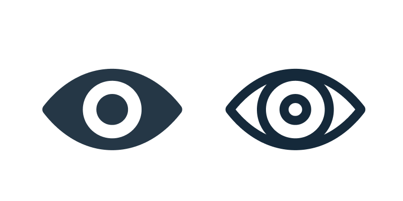
Most of our icons are filled. Filled icons have more visibility in dark mode. Filled icons can also be faster to recognize, as they look like realistic silhouettes. There are other cases where an outline might be faster to recognize depending on the characteristic cues.
Filled icons can also be used to indicate something is “on”, while an outline icon shows it's “off”. An example of a filled icon is an eye icon. A filled eye icon demonstrates the page is being watched. The outlined icon indicates that the page is not being watched.
Color and contrast
Our icons are available to use as a single color. Dark neutrals help with contrast.
For components containing confirmations, alerts, information, and acknowledgments, follow the severity guidelines and color guidelines.
Icons should be a solid color and have a contrast ratio of 4:5:1. Icons shouldn’t be a different color than its accompanying text.
Try thisExample of error icon and red error message.
Not thisExample of error colored icon and regular text
Scale
Icons vary in size.
Small — 16px
- Use for data grids, instructional text, and input fields
- Use when space is minimal
Medium — 24px
- Use for most icons
Large — 36px-48px
- Use in navigation to help with wayfinding
- Use for emphasis
- Use when there’s enough space
Icons vary in size.
Do use the same size for the icon as the text. Don’t mix sizes.
Try thisExample of icon and text the same size
Not thisExample of mismatch
Interactive icon states
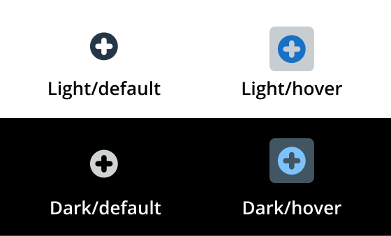
Interactive icons are icons that users can select. Interactive icons should include feedback to help users understand what actions they can take, if any at all.
Hover
When a user hovers on an interactive icon, change the icon’s background to a circle and change the icon’s color.
Disabled
Interactive icons that can’t be selected by a user should indicate that they’re inactive. Use 50% opacity.
Designing new icons
Grid
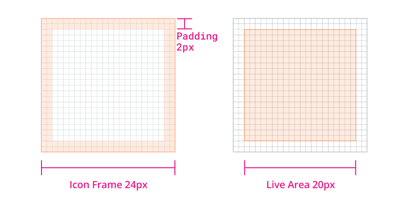
All icons should be drawn on a 24x24px grid frame. Each frame includes key shapes and a 2px padding on all sides as guidance.
Key shapes
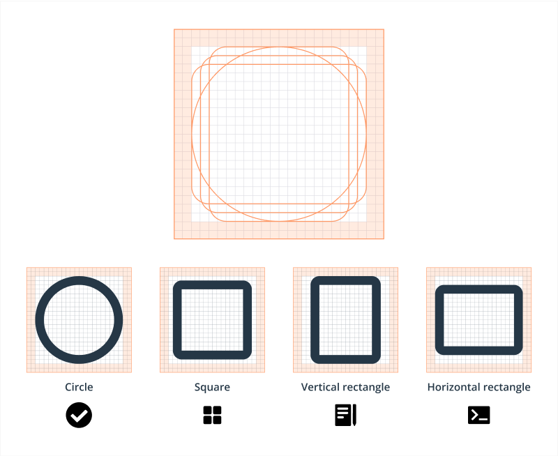
Based on our 24x24px grid, we defined four key shapes: circle, square, vertical rectangle, and horizontal rectangle. These fundamental shapes help us maintain consistency across all system icons.
For example, these icons share the same fundamental circle shape and should be constructed based on that.
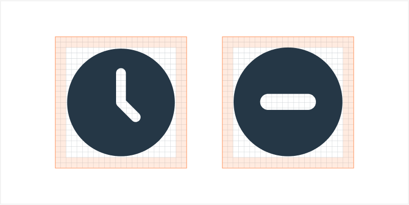
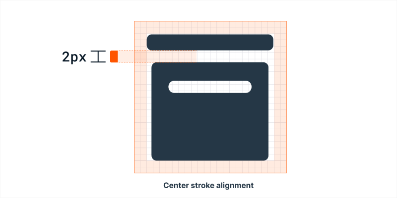
Icon alignment
All icons should be placed at the center of the grid. However, perfectly centered alignment doesn’t always work. It’s important to optically align them instead to achieve the most balanced placement.
Gap
Maintain the same visual gap with a height of 2px.
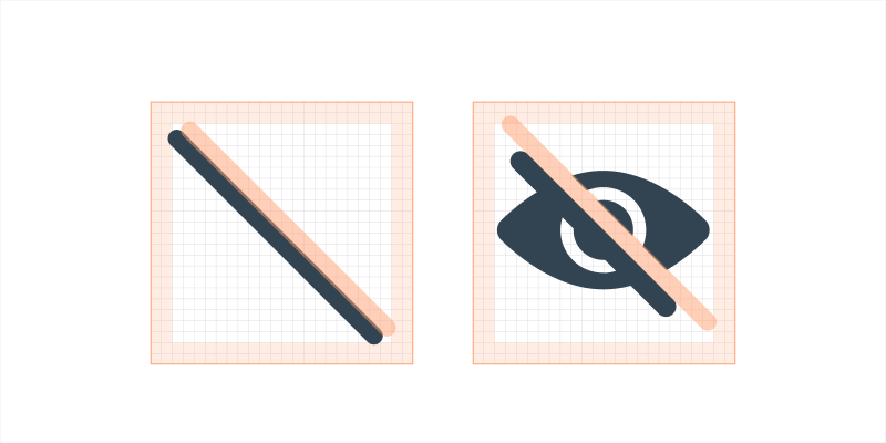
Off icon
Slashes should go from top left to bottom right, and cutouts should follow the stroke size of the system icon.
Modifiers Modifiers are small icons which are drawn on a base icon to indicate action or additional information. The most common examples are plus icon for add, heart icon for like, follow, favorite, etc.
Modifier type The modifier icon shape should follow the base icon type.
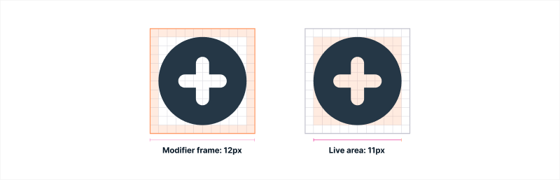
Modifier grid Filled modifiers should be drawn on a 12x12px grid frame. Each frame includes 1px padding on all sides as guidance.
Cutout The cutout separates the modifier from the base icon. To create the cutout, use a 1.5px outer stroke outline and subtract from the base icon.
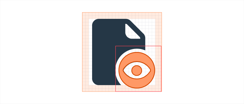
Placement Modifier frame should be overlaid on the bottom right of the icon. However, this placement may not always work. If the modifiers hide the key details of a certain icon, consider a different corner.
You can place the modifier on the padding, but it should not exceed more than 1px from the base icon live area.
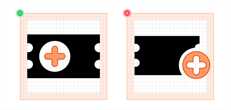
If there isn’t a right placement for the modifier, we can consider creating a new system icon that combines both the meanings of the base icon and the modifier.
See the icon below as an example. Instead of overlaying the modifier on the base icon, placing the plus icon inside the base icon would be more reasonable. We don’t need to cut out any detail from the base icon and it looks more balanced.
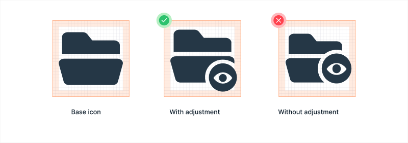
Base icon adjustment A few adjustments can be made to simplify the overall look without affecting the original meaning of the base icon.
Naming new icons
New icon names should be intuitive and simple. The object name should be before the modifier or direction. So, it’s table-clear, not clear-table and chevron-right, not right-chevron.
Resources
Outline Icons vs. Solid Icons: Which are Faster to Recognize and When? KrishaWeb
Should icons be solid or hollow? University of St Andrews
Filled-in vs. Outline Icons: The Impact of Icon Style on Usability University of Carolina
Related
Referenced in this section:
Updated 4 months ago