
Toast Message (New)
Figma | Storybook
Overview
A toast message is a transient, non-intrusive message displayed within an interface providing timely feedback. It's small, unobtrusive, and typically fades away after a brief duration.
Toasts are:
- Unobtrusive: Small and positioned out of the way of the crucial information on the screen.
- Non-interactable: Users cannot engage directly; they must wait for automatic closure or close it manually.
- Short-lived: Generally, toasts fade away after a brief duration.
Use Cases
Toast messages should be used sparingly to preserve their impact and avoid overwhelming users.
Toast messages should be used for:
- Confirmation of completed tasks
- Introduction of fresh elements within an app.
- Guidance throughout the initial set up processes
- Gentle reminders or recommendations
- Quick updates on ongoing activities
Toast notifications are brief reassurances to a user that an action has begun or ended. They should indicate a process has successfully been initiated (status-good), or a process has ended with the appropriate status icon (good, warning, critical). Toasts should not be used to communicate that a process is "in progress", rather it should assure the user the process has been initiated successfully, failed to initiate successfully, or has ended.
The main use case for toasts is messaging related to actions or tasks that the user has initiated. For example, confirmation that an action is being performed or notification that an action has completed.
Outside of this limited use case, toasts should be used sparingly or replaced entirely by a different type of notification. In no way are toasts mandatory elements for a platform’s notification system.
Guidance
The following rules should be followed in implementing toast messages:
Keep copy minimal and precise. Ideally three lines or less.
Toasts should be placed at the top right side of the screen so as to keep consistency across the platform.
Toasts should be on the screen for at least 8 seconds before closing to give the user ample time to read the content.
Avoid using toast messages for critical alerts.
Do not use toasts if the information you're providing contains the following:
- High attention or critical information
- Time sensitive information
- Requires user input or action
- For batch updates.
Multiple toasts
If there’s already a visible toast message a newly triggered toast will appear below it.
Animation
Toast messages appear and are dismissed with an animation lasting 250ms as mentioned in the motion guidelines.
Variations
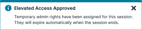
Informational
Informational toasts are only for relatively low priority messaging. Nothing has failed or succeeded, but something neutral has occurred which the user should be made aware of.
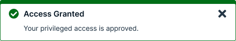
Success
Success toasts inform the user of successful or positive actions within the system.
Usage guidelines
General
Do use toasts for:
- Submissions of an entire form.
- Events that occur “behind the scenes.”
Do not use toasts for:
- High attention and critical information
- Time-sensitive information
- Requesting user action or input
- Batch updates
Content guidelines
Toast messages should be brief, while still providing context to the user. The content in a toast message should be informative, relevant, and timely. Aim for 15 words or fewer.
Informational messages should be specific when possible and provide instruction.
Positioning
The list of toast messages starts in the top right of the page, just below the header. The list expands downward, with the newest message appearing below the last but aligned in a vertical list.
Longer toast messages wrap onto multiple lines. The Dismiss button or icon should align with the top line of the text.
Icons
Toasts have a corresponding icon to the left of the message that indicates what type of message it is, like the checkmark for success. Don’t use other icons.
Toasts or banners
Toasts are immediate reactions to a user action, and should never be used for error messages or to tell a user there is a problem. Banners display messages that are often a summary or notification information generated by the system on a page load or refresh. Use banners for important information, information that a user needs to complete a task, or there is an error.
Accessibility
There are several WCAG 2.0 and 2.1 Level AA standard accessibility guidelines that apply to most toast messages.
Guideline 1: Color Toast messages need to meet the standard color ratio requirements for both text (4.5:1) and activatable components (3.0:1).
Guideline 2: Consistent Identification and location Per WCAG guidelines, all components should be identified consistently. For example, decide whether the information icon has alt-text or whether all information messages will contain the word “information” in them.
Guideline 3: Alt text for non-decorative images Any image that is non-decorative (such as the close button) requires consistent alt-text. If it is an action icon, the focus should be on the action (i.e. “close”) not a description of the image (X)
Guidelines 4 and 5: Keyboard access and Keyboard Focus Indicator Using the keyboard, the user should be able to tab and shift tab through the elements of the toast message. Each activatable element requires a keyboard focus indicator which should meet the minimum 3.0:1 color ratio requirement established by WCAG 2.1 guidelines.
Guideline 6: Focus Order Using the keyboard, the toast message should always show up in the same place in the focus order. This is related to guidelines 2, 4, and 5. If you can tab to all the elements and you are always putting it in the same place, the focus order should be correct. Don’t be tempted to force focus order by using a positive non-zero tab index. That inevitably ends up causing more accessibility problems.
Guideline 7: Orientation New to WCAG 2.1, requires support for both landscape and portrait mode for native apps. If a toast message is initially displayed in portrait mode and the user rotates the phone, it should reorient successfully in the same location. Best practice would be to re-start the countdown after the rotation is complete.
Guideline 8: Announcing toast message content without focus In content implemented using markup languages, status messages can be programmatically determined through role or properties such that they can be presented to the user by assistive technologies without receiving focus. Using ARIA techniques such as role alert and aria-live, toast messages can be made available for screen reading technologies as soon as they are displayed.
Guideline 9: Spacing for Toast message content Toast message content itself cannot experience loss of content or functionality by setting all of the following and by changing no other style property: Line height (line spacing) to at least 1.5 times the font size; Spacing following paragraphs to at least 2 times the font size; Letter spacing (tracking) to at least 0.12 times the font size; Word spacing to at least 0.16 times the font size.
Related
Referenced in this section:
Updated 8 days ago