
Button
Overview
Buttons tell users what actions are available and allow them to perform those actions.
Behaviors
Focus A focus state replaces the browser default focus state for buttons.
Disabled Use disabled buttons sparingly — they’re not accessible. Instead, keep the button selectable and use validation and error messages to explain what a user needs to do to move forward.
Only use disabled buttons if the entire form is disabled, meaning the user cannot interact with any field.
Or if the control the button is attached to is also disabled, like when number fields reach their data limit. Again, use an informative message to explain why the control is disabled.
Disabled buttons should have 50% opacity.
Variations
Primary
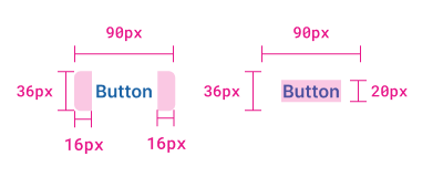
Primary buttons draw attention to an action. There can be multiple of these buttons on a single application page, but they work best when there is only one primary button in a group of actions.
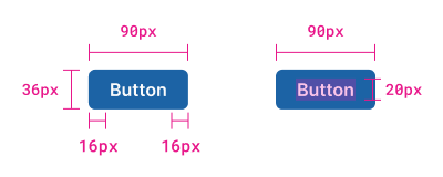
Example of primary button.
Secondary
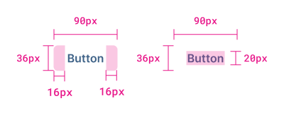
Secondary buttons are used with primary buttons to show other actions the user can do.
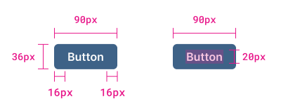
Example of secondary button.
Tertiary
Tertiary buttons are for lesser-performed actions, those that users are unlikely to perform.
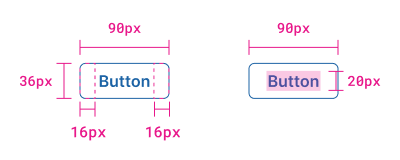
Example of tertiary button.
Danger
Danger buttons warn users about the button action. They are used for permanent or destructive actions.
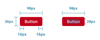
Example of danger button.
Primary text
Text buttons are used in containers with very little content, so they don't blend into normal text. There should only be one primary text button.
Example of primary text button.
Secondary text
Like filled buttons, text buttons can be primary and secondary. Secondary text buttons show users alternative actions they can take that aren’t the “main” or expected outcome. Secondary text buttons are distinguished from primary by being a different color.
Example of secondary text button.
Text with icon
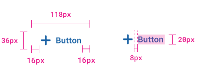
Text buttons with icons can have icons to the left of right of the label. Their label is sentence case instead of all uppercase or title case.
Example of text button with left icon.
Icon only
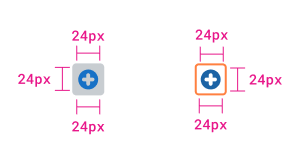
Buttons that are only an icon have a rounded hover and focus state but no label.
Example of icon only.
Usage guidelines
Content guidelines
Button text should tell a user exactly what will happen when they select it. Be specific.
Try thisRetry Scan
Not thisLearn More
Most buttons should be 2 words. The first word should be a verb, and the second one a noun. The exception is commonly recognized buttons like OK, Cancel, and Dismiss. Avoid unnecessary filler words and articles like “the” or “a”. If there’s a third word, it should be descriptive to increase understanding.
Try thisCreate Connector
Not thisCreate a New Connector
Use verbs that are inclusive of all users and devices. Avoid “see” and “click”.
Try this
- View Detections
- Select
Not this
- See Detection
- Click
Wrapping
Buttons wrap to the next line when they don't have space to be on the same line.
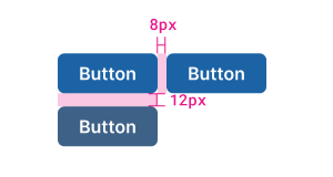
Example of wrapping buttons and spacing between buttons.
Related
Referenced in this section:
Components and patterns that use buttons:
Updated 4 days ago