
Tabs
Usage
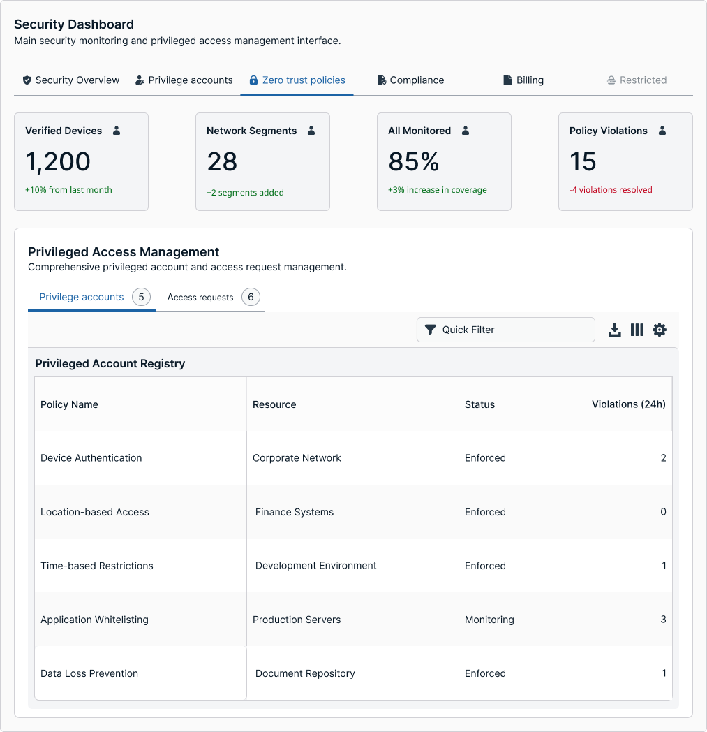
Tabs divide a page into related views, allowing users to switch between sections without leaving the page. Activating a tab replaces the visible content panel while hiding the others. In our system, tabs use a simple underlined style for a clean, consistent look. They can appear horizontally at the top of a page for major sections, or as horizontal sub-tabs within a section for local content switching. Tabs can also display count pills to indicate the number of items or updates within each section. We do not support nested or stacked tabs inside other tab panels; use accordions, segmented controls, or in-page navigation for deeper hierarchy.
Variations and Types
Error
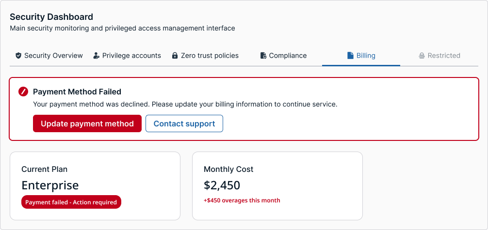
By default, tabs stay neutral—no error icons, no red underlines. Errors live inside the panel as inline field errors or a page-level banner. After a failed Save/Continue, keyboard focus should land on the first errored field; if other tabs contain issues, the banner copy should call them out by name and link to those sections. This keeps navigation calm, avoids red-as-navigation, and prevents ambiguity when more than one section has problems.
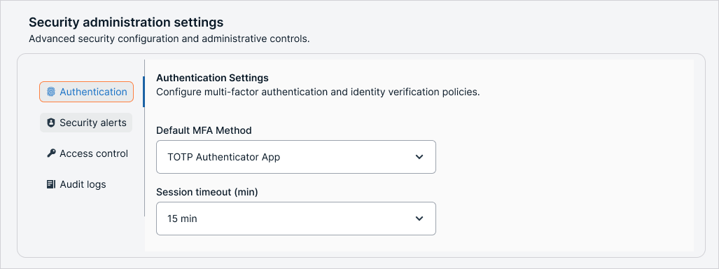
Vertical
Use vertical tabs when there are many items, medium or long labels, or when creating settings-style navigation. The panel surface should have a clear visual relationship to the rail.
The panel surface should be one step stronger than the rail for contrast:
Light mode → panel is lighter than the rail.
Dark mode → panel is darker than the rail.
When not to use tabs
If the change is only filtering or sorting data within the same panel, use segmented controls or dropdown filters instead.
If the destination is a completely separate page or route, use primary navigation or a sidebar menu.
If the goal is to expand and collapse inline content, use accordions.
Tabs should replace the entire visible content area, not just modify a portion of it.
Horizontal vs vertical tabs
Horizontal tabs are best for top-level sections with three to six short labels.
Vertical tabs are better for dense lists or labels that need more space and are often used in settings or administrative tools.
Tabs with icons and tooltips
Icon-only
Tabs work well when space is limited or the icon meaning is universal and clear. If there is any chance of confusion, a tooltip should appear on hover or focus to describe what the tab represents.
Tooltips must be concise and describe the content or function clearly, for example “Overview” or “Alerts.” On touch devices where hover is not possible, the icons must be self-explanatory or paired with an alternate way to show labels.
Placement and spacing
Tabs should align with the page grid or container to create a clear visual hierarchy.
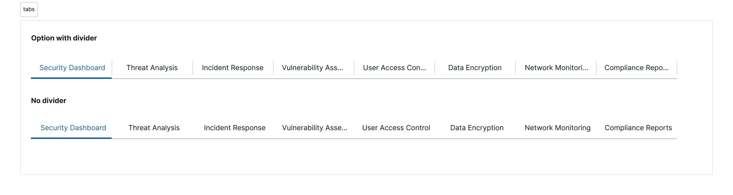
Tab Truncation and Divider
Truncation
Truncation keeps tab labels readable and aligned when space is limited — especially in dense layouts, long labels, or responsive breakpoints. It prevents wrapping or overflow that breaks the rhythm of the tab bar.
When to Use Truncation
Use truncation when:
- The total number of tabs exceeds the horizontal space (typically more than 5–6 tabs).
- Tab labels vary significantly in length (e.g., “Overview” vs. “Advanced configuration settings”).
- Tabs need to remain on a single line for visual clarity (especially top-level navigation or horizontal sub-tabs).
- The container has a fixed width (like a card, modal, or drawer).
Avoid truncation when:
- Labels can be rephrased or shortened meaningfully.
- Grouped or progressive disclosure patterns can replace overflow (e.g., secondary navigation, “More” menu).
- Full labels are critical for comprehension (e.g., similar technical terms).
Behavior
- Truncated labels display an ellipsis (...) at the end of the text.
- A tooltip should appear on hover or focus to reveal the full label.
- Maintain consistent horizontal padding so the ellipsis does not visually shift the tab alignment.
Divider
Dividers visually separate tabs from the content area or from each other, helping users orient themselves within a dense interface.
Usage
-
Use a 1px divider line below horizontal tabs.
-
Divider color should use the border-subtle token to maintain contrast hierarchy without overpowering active states.
-
Avoid stacking multiple dividers; if the layout already includes a container border, skip the internal divider to prevent double lines.
Accessibility
Tabs must support keyboard navigation with arrow keys. The active tab must have a clear focus state and visual indicator such as an underline. ARIA roles are required: tablist for the container, tab for each tab, and tabpanel for associated content.
Example uses
Dashboard: horizontal tabs to navigate between Overview, Activity, and Reports
Admin settings: vertical tabs for different categories like Access, Notifications, and Roles
Multi-step process: tabs represent steps, showing progress and clearly indicating where errors must be fixed.
Avoid these...
Too many tabs: more than seven tabs in a single row creates clutter. Use vertical tabs or group content into fewer sections.
Ambiguous icons: if icons are not universally understood, add tooltips or reconsider the icon choice.
Nested tabs: avoid multiple levels of tabs unless absolutely necessary, and make visual hierarchy very clear if used.
Updated 4 months ago