
Modal
Overview
Modals are pop-ups that require users to choose an action before they can continue.
Other names: Dialog, Pop-up, Modal Window
Behaviors
Overlay
When a modal is triggered an overlay of 50% opacity covers the entire screen, except the modal. This prevents users from interacting with anything but the modal. When the modal is dismissed, the black overlay is removed.
A box shadow is applied to the modal to make it stand out as a separate element.
Example of a modal and the background overlay. The overlay is black with 50% opacity.
Actions
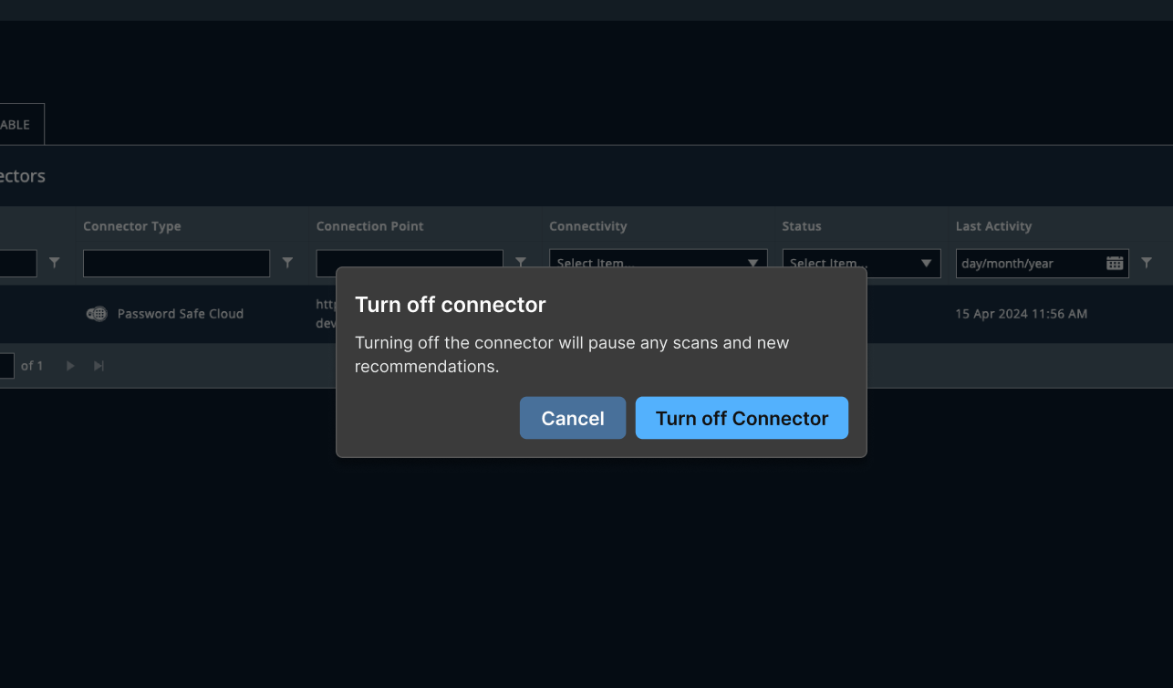
Every action on a modal dismisses it. There is no close X icon. Users must select an action to dismiss the modal, even if it’s cancelling what they were asked to confirm. Selecting the area outside of a modal does nothing to dismiss it. Examples of actions are confirmations, acknowledgements, and reminders.
Actions in a modal are presented using one primary button and one or, in rare cases, two secondary buttons. If the modal is being used to confirm a destructive action, use a danger button. These buttons appear in the bottom right of the modal. Actions buttons can wrap, if necessary. The primary button has focus when the modal opens.
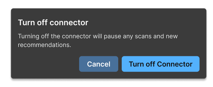
Example of a confirmation modal with a primary and secondary button.
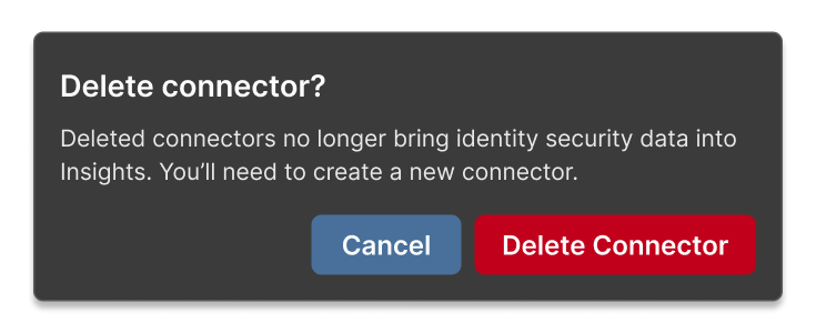
Example of a modal for a destructive action. The primary button has the danger style applied.
Usage guidelines
General
Try to use modals sparingly. They can interrupt flows if a user isn't expecting them. It can also get annoying if we ask a user to confirm something they do every day.
Use modals to confirm an action when the action is:
- Irreversible — like permanently deleting an item.
- Severe — if the action has critical consequences that are system-wide or long-term repercussions.
- Complex — like configuring other devices.
Content guidelines
Title A modal title should be short, only a few words. It should be clear, specific, and unambiguous.
A confirmation modal should be titled what action the user is confirming and be posed as a question. Confirmation modal titles use sentence case.
Try thisDelete rule?
Not thisWarning: You are about to delete a rule
Body text The body text allows you to go into more detail but shouldn’t be more than a few lines. Body text should be left-aligned.
Confirmation modals should avoid the phrase “are you sure?” It’s a cliché, it doesn’t fit our brand voice or hit the right tone, and it doesn’t really prevent the user from doing something.
Instead, just focus on the consequences of the action the user is confirming.
Try thisDeleting a rule cannot be undone.
Not thisAre you sure you want to proceed? This action cannot be undone.
Button The primary button should match or mirror the title.
Try thisDelete rule
Not thisContinue
Placement
Modals sit on top of the rest of the page content. This includes overlay panels. Modals should appear in roughly the middle of the screen.
Resources
The journey is theirs, we just write for it Chelsea Larson, Smallish Book
Are you sure you want to do this? Microcopy for confirmation dialogues Kinneret Yifrah, Medium
Related
Referenced in this section: Button component
Components and patterns that use modals:
Updated 8 days ago