
Pagination
Overview
Pagination allows users to navigate between large amounts of content that have been split into pages.
Behaviors
Disable
Pagination controls are disabled while the corresponding component loads.
Pagination controls
Pagination controls are used to navigate pages of data. These controls appear to the left-most side of the component.
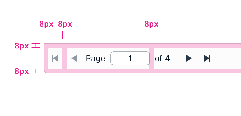
Example of pagination controls.
First page Navigates the user to the first page of the dataset. This control is disabled if a user is already on the first page.
Previous page Navigates the user to the previous page in the dataset. Previous always meaning 1 lower in the page count, not the last visited page. For example, a user on page 5 would be taken to page 4. This control is disabled if the user is on the first page.
Text field Pagination has a text field where users can input a page number. When the user presses the enter key or removes focus from the field, it takes them to the page they input.
The label around the text field is "Page" and "of Y”. The current page is the text field value and the Y is the total number of pages. If there’s no data, the text in the pagination control should be “Page 1 of 1”.
Only numbers can be entered into the text field. Entering a number above the maximum page count automatically lowers it to the number of the last page. For example, entering 5 when there are only 4 pages changes the value to 4 — the Kendo default. Entering 0 changes the value to 1.
Next page Navigates user to the following page in the dataset. For example, if a user is on page 5 they would be taken to page 6. This control is disabled if the user is already on the last page.
Last page Navigates user to the last page in the dataset. This control is disabled if the user is already on the last page.
Items per page drop-down
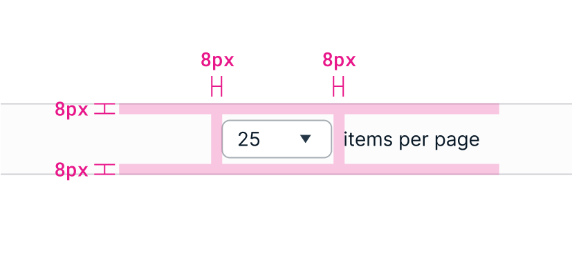
Example of spacing around dropdown and items per page text.
A drop-down in the middle of the component lets the user select how many items to display per page. The options are 10, 25, 50, 100, and 200. 10, or the lowest amount, should be the default. This selection should persist for the user if the application supports it. The drop-down does not support an empty value.
The drop-down label should be "X items per page”. The value of X is a drop-down with the current selection, followed by “items per page”.
The width of the drop-down is smaller than a typical drop-down. They should be just wide enough to contain the largest value without cutting off any text. Kendo will truncate any text that doesn’t have room.
Showing items text
Text reading "X-Y of Z items" appears on the right-most side of pagination. X and Y is the range of data items that are shown on the current page, and Z is the total number of records. As a user pages through the data, the current range automatically changes to show where they are in the dataset. For example, “41-65 of 500 items”.
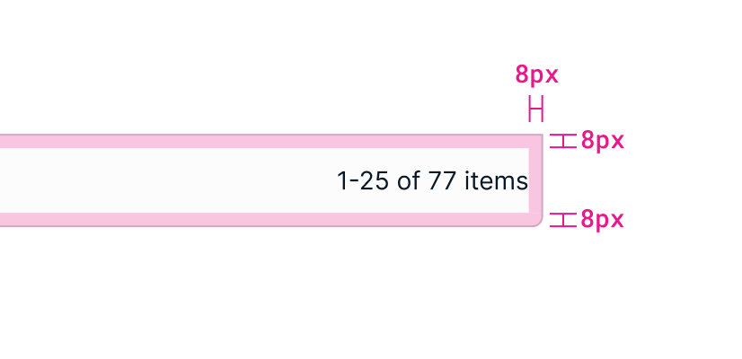
Example of showing items text.
Usage guidelines
General
Pagination is normally used for data grids and lists. If there is no data loaded in the component, pagination is shown but disabled.
You can choose to not use pagination for data tables and lists with minimal data, but only if you are certain that the dataset will not get any bigger.
Content guidelines
Labels There are 3 labels that make up pagination. A text field label on the left, a drop-down label in the middle, and another label on the right.
The text field on the left has the label "Page X of Y”.
The drop-down label in the middle is "X items per page”. The value of X is the drop-down, followed by “items per page”.
The third label on the right is "X-Y of Z items". If there is no data to be paged through, the label should be “Page 1 of 1”.
Position
Pagination is placed at the bottom of the component it controls. It extends the full width of that component.
Related
Referenced in this section:
Drop down component
Components and patterns that use pagination:
Updated 8 days ago