
Slider
Overview
Sliders allow users to select a value from a fixed, sequential set of numbers. Users can click and drag a handle along a track or click the ticks on the track to adjust the value.
Behaviors
Focus
Only the handle of the slider has a focus state.
Hover
Only the handle of the slider has a hover state.
Disable
Sliders are at 50% opacity when disabled and can’t be interacted with.
Select
The handle on the slider track indicates the current value. The handle can be moved on the track to change the value by:
- Clicking and dragging the handle.
- Selecting a tick mark.
- Selecting a tick mark label.
- Using the arrow keys.
Values
Sliders always have a default selected value and have a minimum and maximum value.
Variations
Horizontal
Most sliders are horizontal. Horizontal sliders have a handle that moves left and right along a track. Labels for the ticks are displayed under the track.
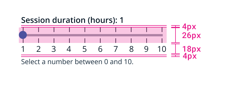
Example of horizontal slider dimensions.
Vertical
Vertical sliders have a handle that moves up and down along a track. Labels for the ticks are displayed to the right of the track.
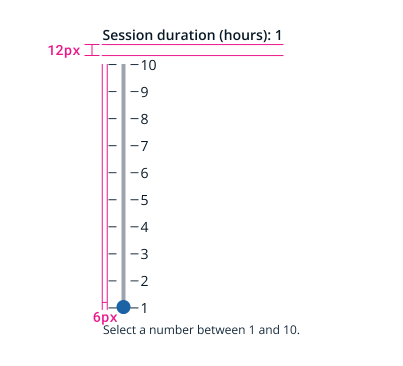
Example of vertical slider dimensions.
Usage guidelines
General
Sliders allow users to choose single value from a fixed, sequential set of numeric values.
Content guidelines
Labels Slider labels for both horizontal and vertical variations appear above the slider and left aligned.
Slider labels should be short, only a few words. They should indicate to the user what value they’re selecting.
Instructional text If instructional text is required, it should be short and verb-first. It’s not meant to replace the label or be used for examples. Instructional text for both horizontal and vertical variations appears below the slider.
Related
Referenced in this section:
Updated 8 days ago