
Number Field
Overview
Number fields allow users to enter a numeric value and incrementally increase or decrease that value.
Other names: Numeric, Stepper
Behaviors
Focus
The number field’s border color changes on focus.
Hover
The buttons change color on hover. The field itself does not change.
Error
Error states in a number field change the color of the border and display an error message below the field. Number field errors are only triggered when a null value is in a required field. Entering a value should clear the error and change the border to the normal color.
Kendo does not display errors for number field values that are outside the allowed range. It’s possible for both an error and instructional text to display at the same time. When this happens, the error message appears below the instructional text.
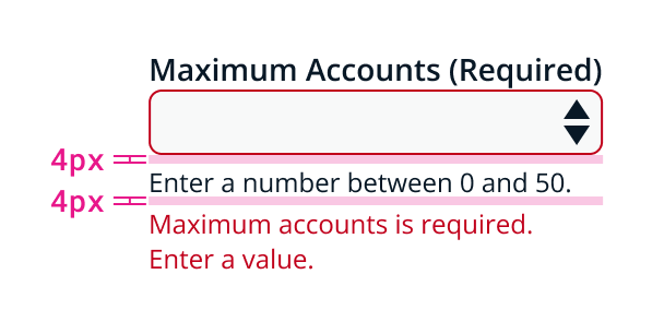
Example of number field in error state with instructional text.
Disable
When disabled, the field is shown with a darkened background and the buttons are at 50% opacity. The field and icons can’t be selected, focused, or interacted with in any way.
Help text
Number field labels can give extra context or information using a help text component. This appears as a question mark icon to the right of the label.
Instructional text
Instructional text appears below the number field. Instructional text usually does not extend past the field’s width, but number fields are an exception due to their smaller size. Instructional text should still be brief, but if more detail is needed then the text can wrap.
Always use instructional text when a number field has a set range. This prevents the user from entering a number outside of the range.
It’s possible for both an error and instructional text to display at the same time. When this happens, the error message appears below the instructional text.
Buttons
Number fields have up and down arrow buttons. These buttons are rectangular and are inside the container to the right.
Selecting these buttons increases or decreases the amount by one. The up and down keyboard keys can also be used to change the amount.
If the value can be 4 or more digits, use a text field instead since users will often prefer to manually enter long numbers.
Values
By default, the buttons change the number field value by one.
Special characters are not allowed in number fields. A null state is represented by the field being empty, rather than using double hyphens.
Null state
If number fields don’t have a value, the field is in a null state.
The arrow buttons change the number field’s value when it’s in a null state. The down arrow changes the null value to the minimum number in the allowed range. The up arrow changes the value to one above the minimum number.
Null states are different than 0.
Minimum and maximum values
Number fields require a minimum and maximum value. The user won’t be able to exceed these limits by using the buttons. If the user manually enters a number above or below the configured number range, the field automatically changes the value to the closest acceptable number.
Usage guidelines
General
Do use number fields:
- If there is a use case for changing the number by increments
- If the value is less than 4 digits
Don’t use number fields:
- If the value is larger than 4 digits — use text fields instead
- For values that are part of a subset — use a drop down or radio buttons instead
Content guidelines
Label Number field labels should be concise, but should clearly explain what the user needs to enter. Use sentence case.
Try thisDays disconnected
Not thisAmount of Days Computer Has Been DIsconnected
Error message The error text that appears below the number field should be brief. Error messages should explain to the user in plain language what went wrong and what they can do to solve the error.
Try thisDays disconnected is a required field.
Enter a number.
Not thisError. Value is null.
Instructional text
Instructional text should let the user know the minimum and maximum value and help them fill out the field. Examples can be helpful sometimes, but clear instructions are better.
Try thisChoose a number between 1 and 365.
Not thisE.g.,324
Accessibility
The up and down keyboard keys can increase or decrease the number field’s value.
Related
Referenced in this section:
Updated 8 days ago