
Banner
Overview
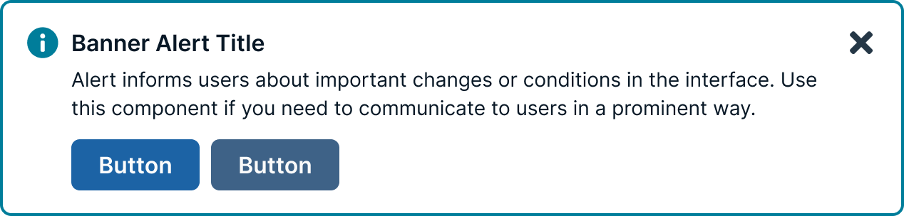
Banners provide a method for communicating with users and sharing feedback. They come in four statuses which, when combined with the right variants, make notifications that are relevant, timely, and informative for each use case. Their status signifies the purpose of the information being conveyed and allow you to tailor the disruptiveness of the notification to the specific situation.
These messages reside within the applications or products themselves. Banners are interactive compared to toast messages, they facilitate quick decisions, prompt navigation adjustments, and collect previous communications. Though diverse, they maintain strong connections with toast messages since they occupy shared territory across the application.
Usage guidelines
Banners can be used in design to enhance the user experience by providing important information and guiding users to take actions:
Provide information
Banners can provide users with relevant information, such as updates, offers, or alerts. They can also be used to display legal or usage policies.
Guide users
Banners can be used to direct users' attention to important content or guide them towards specific actions. For example, a banner can encourage users to register for an event, upgrade their account, or read a notice.
Improve discoverability
When placed strategically, banners can improve discoverability, engagement, and overall usability.
Persistent messaging
Banners can be used for persistent messaging or to keep important information visible to users at all times.
General
Do:
- Ensure banner notifications are integrated so they do not obscure other content.
- Position system-wide messages directly below the main header or navigation bar.
- Configure banners to scroll naturally with the rest of the page content.
- Limit the display to a single banner at any given time.
Don't:
- Send notifications unless they are strictly necessary.
- Place notifications outside of the interface or workflow they relate to.
- Interrupt the user’s experience with unnecessary alerts.
- Overwhelm users with frequent notifications that cause alert fatigue.
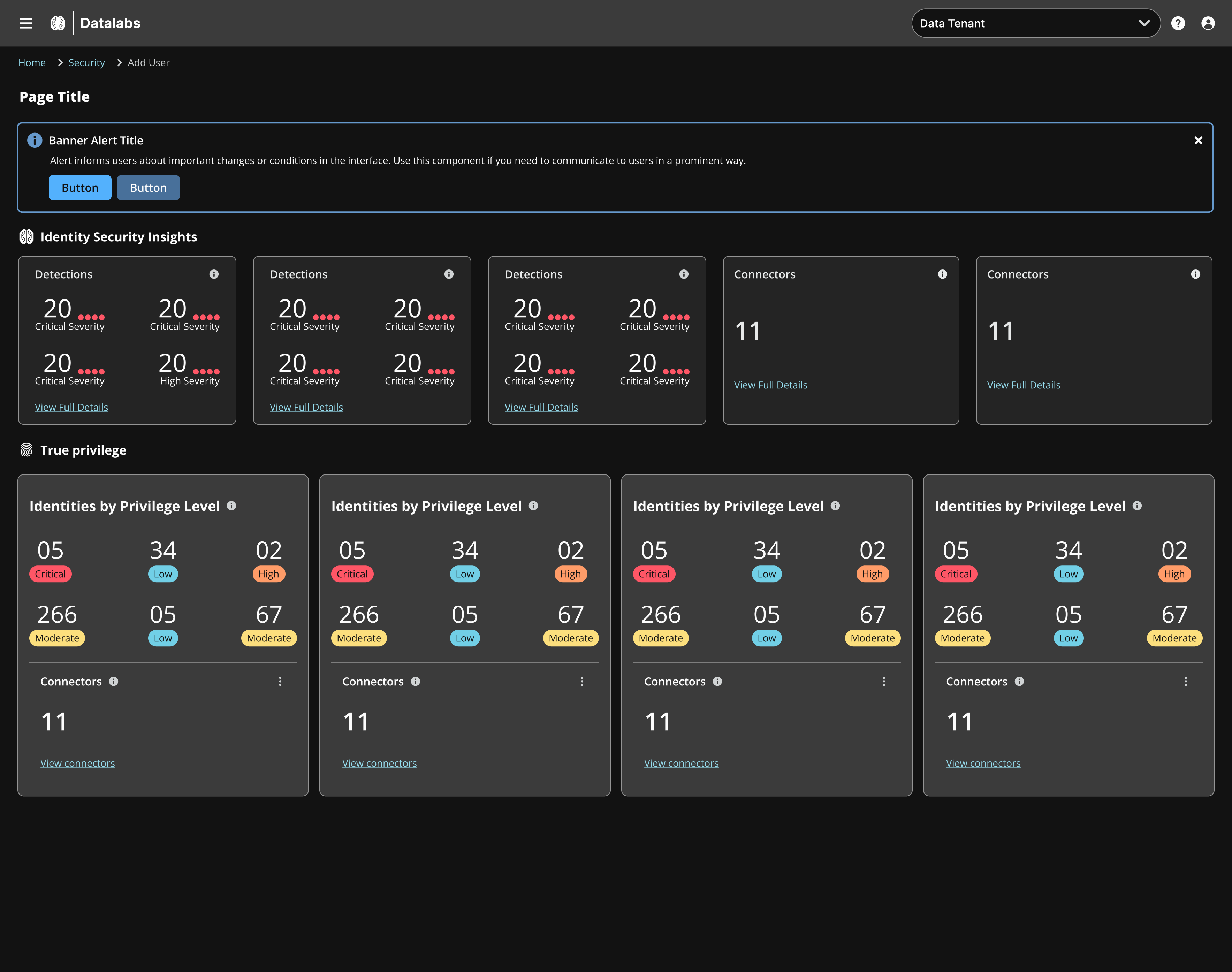
Position
Always position banners at the top of the screen, immediately beneath the primary navigation or the page-specific header, to ensure they are contextually relevant to the content below. Only show one banner at a time.
Content Guidelines
Banner messages should be brief, while still providing context to the user. Banner messages should be brief and scannable, ideally limited to 10–25 words. If longer content is required consider using a different component (modal or in-line alert)
Banners or Toasts
Banners display messages that are often a summary or notification information generated by the system on a page load or refresh. Toasts are immediate reactions to a user action, and should never be used for error messages or to tell a user there is a problem. Use banners for important information, information that a user needs to complete a task, or there is an error.
Accessibility
Don’t use notifications that dismiss on a timer for critical or emergency messages. Some users with disabilities need more time to read or interact with messages and timed actionable toasts may not provide sufficient time. WCAG 2.1 success criterion 2.2.4 (AAA).
Users should be able to manage or limit noncritical notifications. This gives users the control to reduce the number of distractions or disruptions they receive, which is particularly helpful for users with cognitive limitations. WCAG 2.1 success criterion 2.2.3 (AAA).
Updated 1 day ago