
Form
Overview
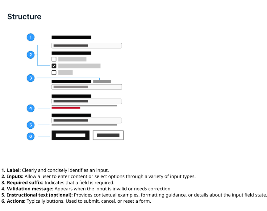
A form is a collection of fields that allow users to input, submit, or update information. It typically includes components like text fields, drop downs, checkboxes, radio buttons and action buttons to capture structured data.
Form structure
A well designed form features clear groupings, intuitive fields and concise instructional text. Key structural principles include clearly visible labels positioned above the input fields, logical groupings of fields, and should only include fields that are essential for the user to complete their task. It's important to match input types to the expected data format.
Layout
Forms are generally laid out in a single column with top to bottom content. Component sizing should be consistent throughout the layout pattern.
Vertical spacing
Forms can use as much vertical space as necessary, but overly long forms should be avoided as they can cause frustration for the user and affect completion.
Forms should be left aligned.
Button placement
The submission button is the final element, used to complete the form and send information. Primary buttons should be used for submission. If there are multiple buttons, such as an option for saving for later or going back, the secondary button should be used. In a horizontal layout, the primary button should be on the left. If the buttons are stacked, the primary button should be the top button. See button component guidance for more information.
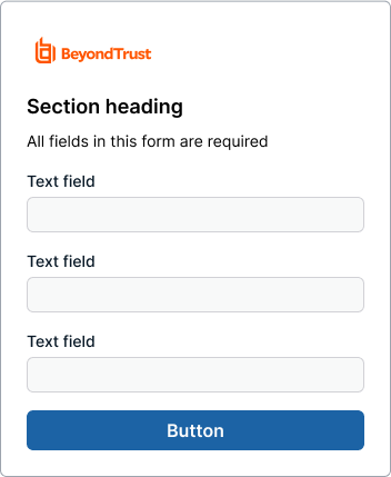
Example of button placement in a login screen.
Visual indicator (Required/Optional)
If all fields are required, state that it is all required at the top. Do not mark each field individually.
If there is a mixture of required and unrequired fields, only the required fields should be marked with "required" in the field label. Optional fields should not have an optional field label.
The only exception is for single field patterns like a login where it's safe to assume that the field is required without any label.
Form validation
Effective form validation helps users navigate the form completion process accurately.
To ensure information retention, forms must validate that their submission outcomes provide clear error messages if a submission fails. These error messages should be specific visible, and guide users toward a resolution. When a form is successfully submitted, users should receive immediate feedback through a "success" message or modal.
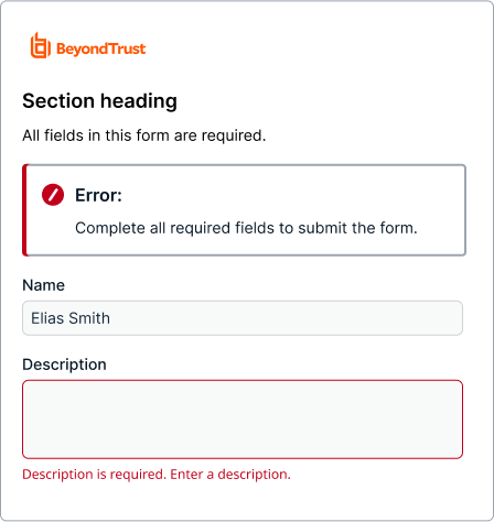
Proper error notification in a field.
Error notification
If a form submission is not successful, users should be immediately alerted to the problem or error in the form of a message bar or modal.
While long forms should be avoided where possible, message bars on longer forms should include a link to the error field to aid in quick comprehension. Common user errors include empty fields, invalid inputs, and inputs that exceed the character count.
Inline error
If the error is caused by the user's actions, a field level error should populate. It should give instructions on what the error is and be easily readable for the user.
Hiding elements
Hide an element if the user doesn't need access to it.
Disabling elements
Disable an element with the disabled attribute if the user lacks permission to interact with it, but still needs to know that it exists.
If an element is already populated, but the user doesn't have permission to edit it, use the read-only attribute. By default, a submit button is enabled. Do not use a disabled submit button to show that there is an issue with validation or a change is incomplete.
Disabled submit buttons can create a variety of issues such as being missed by a screen reader.
Consider using a contextual message to indicate if additional action is needed instead.
Content guidelines
Fields
Limit the number of fields to what is necessary.
Grouping
Group related form components under section titles to give users context. For example, state and zip/pin code can be grouped under "Address".
Punctuation
Field label text does not require punctuation, but instructional text usually does. Avoid using colons at the end of label text.
Clear label
Text field labels should clearly state the required input in 1 to 3 words. Label text is different from instructional text; avoid using them for the same purposes.
Accessibility
An error should not be indicated by color alone. Identify an error with appropriate text and optionally an icon. This helps users who can not see color, or who are using assistive technology.
Updated 4 months ago