
Empty States
Overview
Empty states are a simple yet extremely powerful way to keep a user informed, supported, and on a productive path. They provide opportunities to communicate what the user would see if they had data, while providing constructive guidance about next steps.
With just enough contextual guidance, empty states ensure a smooth experience, especially when things aren’t working as expected.
This pattern explores the following approaches:
Basic empty states for first use, user action confirmation, and error management. In-depth supplements and alternatives for first use empty states, including in-line documentation, onboarding, and starter content.
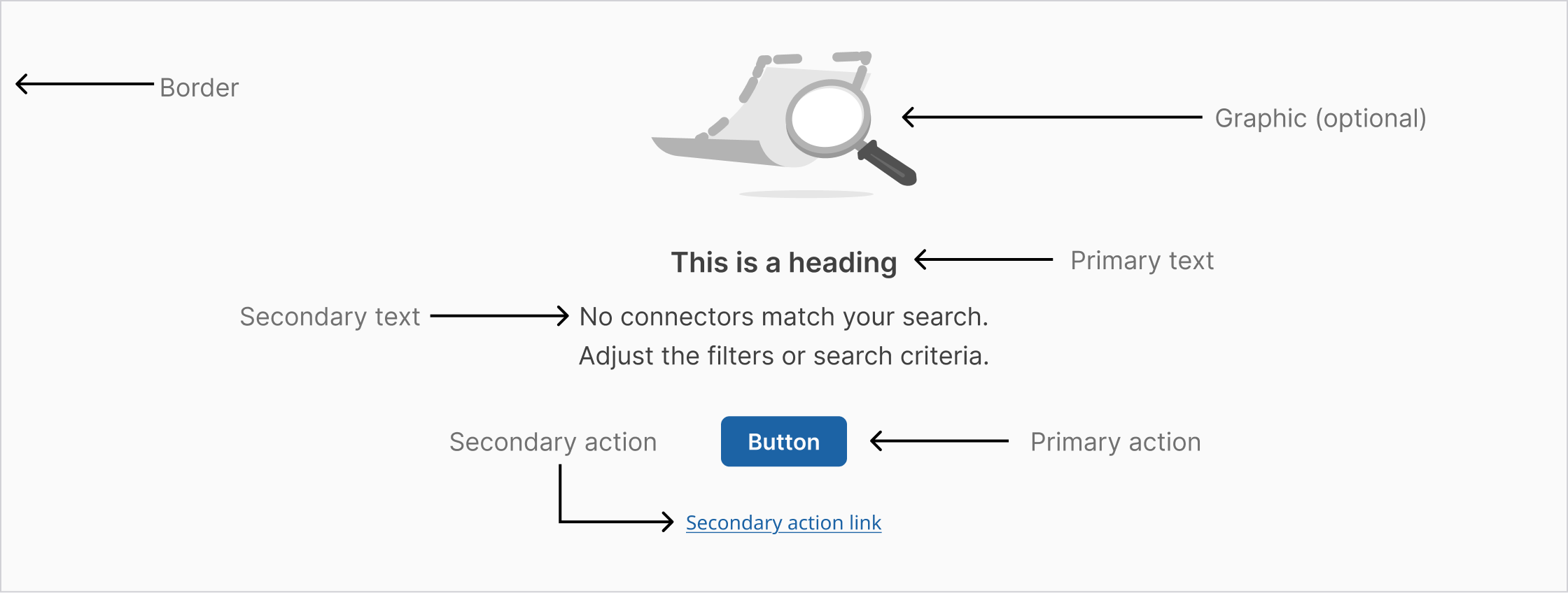
Basic empty state with primary action button
Image (optional): A non-interactive image that relates to the situation (optional).
Title: A short and concise explanation. Where possible, write this as a positive statement. In this example, “Start by adding data assets” feels more positive than “You don’t have any data assets.” Alternatively, you could say “You don’t have any data assets yet”.
Body: Explain clearly the next action to populate the space. You may also explain why the space is empty and include the benefit of taking this step.
Action: There are three options for explaining the primary action:
- Direct the user to a primary action button positioned underneath the copy Include a primary action link in the copy.
- Direct the user to the UI element. This has the benefit of teaching the user where elements are and how they will perform tasks in the future.
- Primary action—button or link in copy (optional): The primary call to action referenced in the body copy above.
Secondary call to action (optional): If there is a secondary action, such as referencing documentation for further reading, include it as a link below the copy.
Where to use
Empty states always appear in the otherwise empty space, in the context of the data that’s missing. They can occur anywhere your app can display data, including but not limited to dashboards, data tables, tiles, full pages, and side panels.
The approach and layout you choose will depend on the situation, and what is the most appropriate based on the page layout and context.
Visual guidelines for smaller empty spaces
For small tiles and side panels, follow these guidelines and use the layouts shown below.
Alignment of elements
Empty state elements should be left-aligned as a block. The one exception to this rule is an empty state in a small tile. In this case the image should be centered above the left-aligned text and primary action, as shown in the example below. This exception was made to prevent the empty state looking too much like content, where it could be skipped over. The centered image in a smaller space helps to draw attention to a state that may require user action.
Image choice considerations
The image choice should relate to the situation. The size of the space for the empty state should also guide the size of the image. If space is limited, use just text.
Multiple empty states
In situations where there could be multiple empty states showing at once, we recommend using a tertiary button for the call to action. This avoids scenarios with multiple primary action buttons in the UI.
Examples
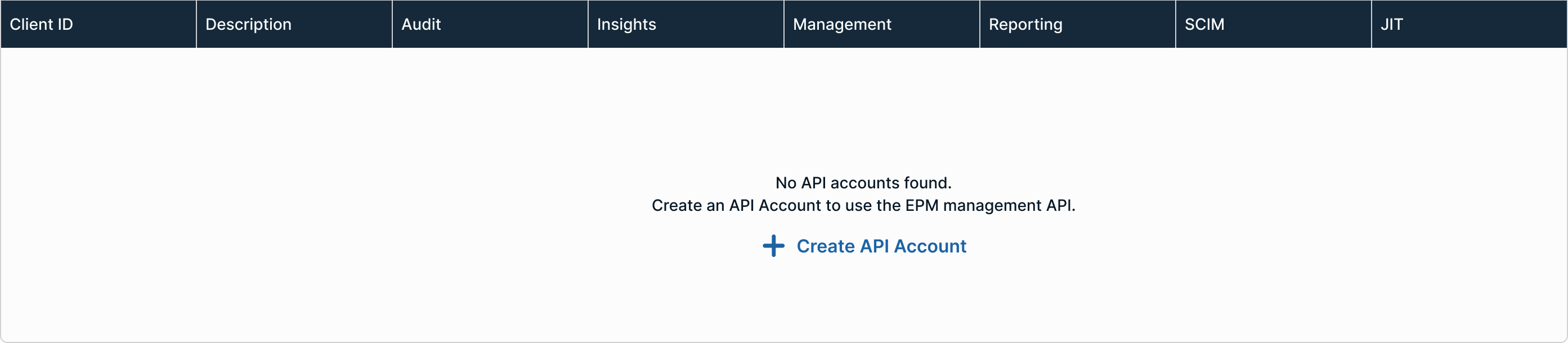
In-table
When displaying security-related tables, such as access logs, policy changes, or privileged actions, empty states should retain the table headers to give users clarity on what will appear once data is available.
For example, if a table for “Privileged Access Requests” is empty, keeping the headers (e.g., Requestor, Role, Status, Timestamp) helps users understand the kind of activity this view is meant to show. This sets accurate expectations and prevents confusion between "no data" and "broken system".
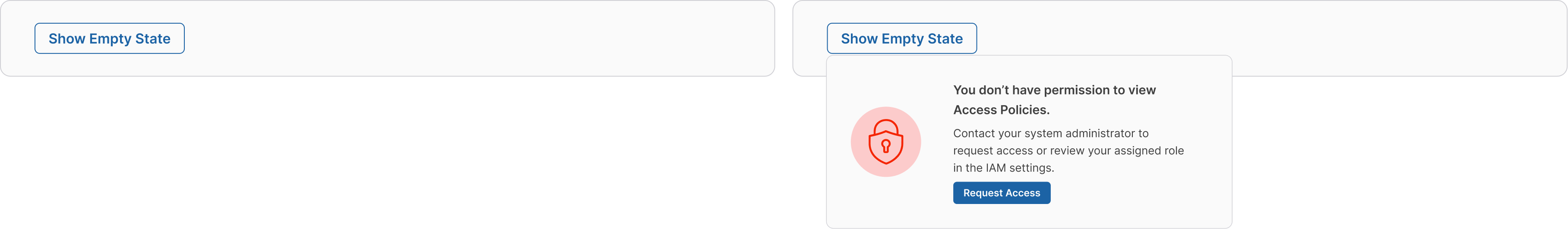
Non-table
Empty states for content outside of a table include a background color to create variations on screens where there are multiple empty states or when an entire screen is blocked. For example, if an entire screen is blocked because a user doesn’t have the necessary permissions, a background is added to the empty state to create contrast and containment.

Small
When design real estate is limited, consider using a small empty state.
Minimal
The smallest acceptable empty state uses only a visual and headline. Minimal empty states typically occur in small components, like drop downs or side sheets within tables.

First-time User Experience
Welcoming empty state that guides new users to take their first action.
Dos and Don'ts
Do
- Use positive, encouraging language
- Provide clear, actionable next steps
- Use relevant icons that match the context
- Explain why the state is empty
- Offer multiple action options when appropriate
Don't
- Use discouraging or negative language
- Leave users without any action to take
- Use generic "No data" messages
- Overcrowd the empty state with too many options
- Use bright colors or attention-grabbing animations
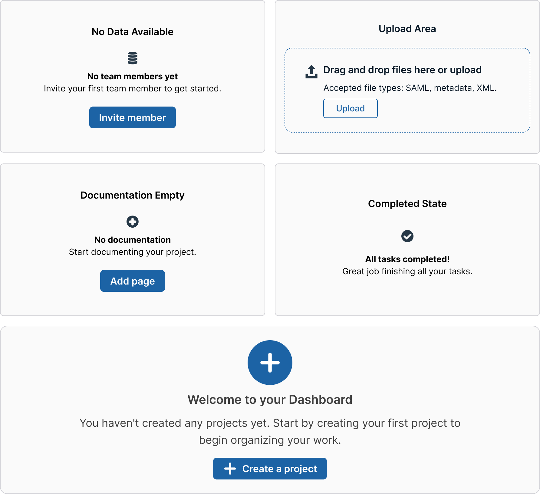
Variations & States
- First-time user experience (onboarding)
- No search results found
- No data available yet
- Error states with recovery actions
- Loading states before content appears
- Completed states after bulk actions
Accessibility Guidelines
- Provide meaningful alt-text for empty state illustrations
- Ensure sufficient color contrast for all text elements
- Make action buttons keyboard accessible
- Use semantic markup for screen readers
- Include ARIA labels for icon-only actions
- Provide clear focus indicators
Updated 1 day ago