
Progress Indicator
Overview
Progress indicators visualize the status of an action. Use progress indicators to show users how much of the process has been completed, and how much is still left to go.
Other names: Loading, Spinner, Determinate, Indeterminate, Progress Bar
Behaviors
Animation
Indeterminate progress indicators
Repeating progress indicators, known as indeterminate progress indicators, are on an endless cycle through their animation. The indeterminate line takes 1 second to fully travel from start to finish. The indeterminate circle takes 1.4 seconds to complete a single rotation.
Determinate progress indicators
Determinate, or non-repeating progress indicators, move at the same speed as the loading data. For example, if the data takes 20 seconds to load, then the determinate line takes 20 seconds from start to finish.
Variations
Determinate line
These progress indicators are provided a value between 0 and 100 to determine what percentage of the line is filled. Line indicators fill the width of their container.
Indeterminate line
These progress indicators endlessly repeat. They can move in either direction. The animation restarts once the indicator is fully finished.
Indeterminate circle
Circular progress indicators endlessly repeat a spinning motion. It takes 1.4 seconds to complete a rotation.
Reverse determinate line
Reverse determinate line indicators have the same behavior as determinate line indicators, except the value decreases from 100% instead of increases. These indicators are helpful to show a “countdown” and are used in toasts.
Usage guidelines
General
Determinate vs indeterminate
- Determinate indicators work best if there are specific steps in the process that the user can follow along with, or if the expected load time is more than a few seconds. Use determinate when the percentage completed can be displayed.
- Indeterminate progress indicators should be used when the load time is unknown.
Line vs circle
- Use line indicators in grids, cards, and buttons.
Example of repeating line indicator in grid.
- Use circle indicators in the middle of the screen, next to buttons, and next to transitional text.
Content guidelines
Transitional text
You can use words to help support progress indicators. This text should communicate what action is underway and that users will have to wait.
Use specific verbs and ellipses, like:
- Saving...
- Retrieving Info...
- Deleting...
Labels
Progress indicators need accessibility labels to help users who can’t rely on visual cues. Use labels that clearly describe the purpose of the progress indicator and what content will be loaded. Keep labels concise—1-3 words on a single line of text.
Circular progress indicators can have labels. If a standard label cannot be used due to space, like on toasts and grids, then the indicator should use a hidden aria label. The label should indicate what content is loading and what the action is. For example, “Refreshing grid…”.
Progress indicators with buttons
In its default state, a button with an integrated progress indicator is not discernible from a regular button.
Once a user has selected the button, a linear progress indicator appears directly above. This should not shift any elements on the page. Transitional text appears to let the user know what action is underway.
If the action fails or succeeds, an error or success message appears to the right of the button with a corresponding icon. The progress indicator is hidden at this point.
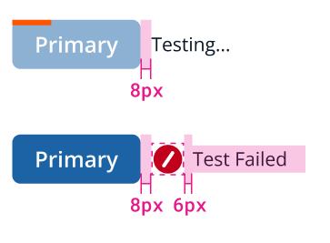
Example of progress indicators with buttons.
Placement
Determinate progress indicators are typically placed at the top of the button, card, or panel that has the loading process. They are in a fixed position at the top 4px of the container’s space. Content is not pushed down when it appears or disappears.
Related
Referenced in this section:
Components and patterns that use progress indicators:
Updated 8 days ago