
Progressive Disclosure
Usage
Users often want powerful features without the complexity of learning how to use them. Progressive disclosure solves this by revealing only the most essential information upfront, while keeping advanced options easily accessible. This approach reduces cognitive load, supports decision-making, and makes complex interfaces- like security settings or permission editors- feel more approachable. Use it to guide users step by step, without overwhelming them.
What is Progressive Disclosure?
Progressive Disclosure is a design strategy that surfaces only the most important information or actions first- and reveals more details as needed, based on user context or intent. It reduces cognitive load, simplifies UIs, and supports user confidence by showing less, then more.
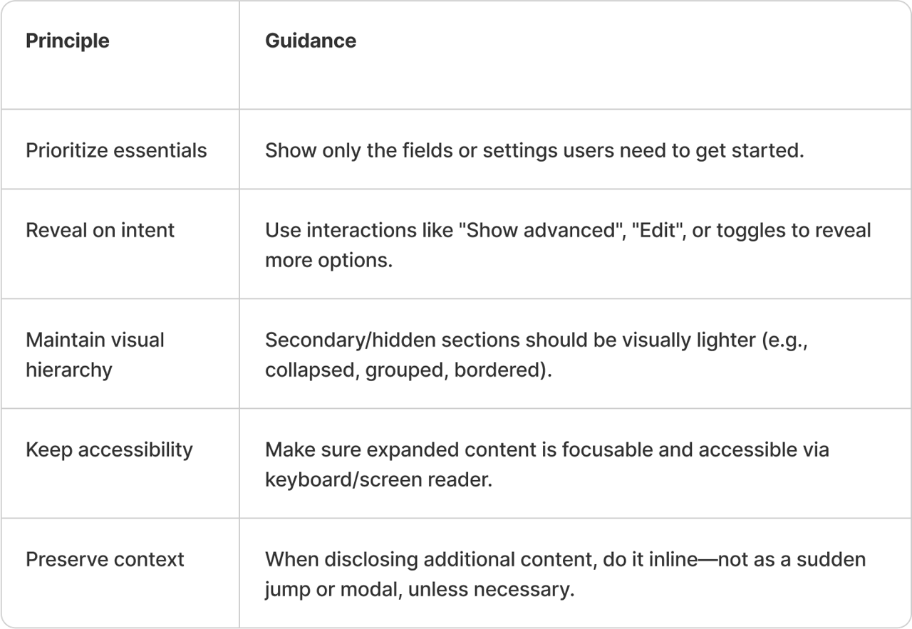
How to choose what’s most important?
When choosing what should be visible upfront and what can be progressively revealed, ask yourself a few key questions:
- What’s the user’s primary goal on this screen—not just overall?
- What information is helpful sometimes, but not always?
- Are there advanced settings that only apply to niche scenarios?
- If everything were shown by default, what would most users choose to hide?
- Is any content simply an explanation of something already visible?
User testing can help clarify what’s truly essential. Once you’ve answered these questions, prioritize what matters most in the moment. Keep it clear and visible, and organize everything else so users can easily access it, only if and when they need to.so that users can clearly see how to access it if they want.
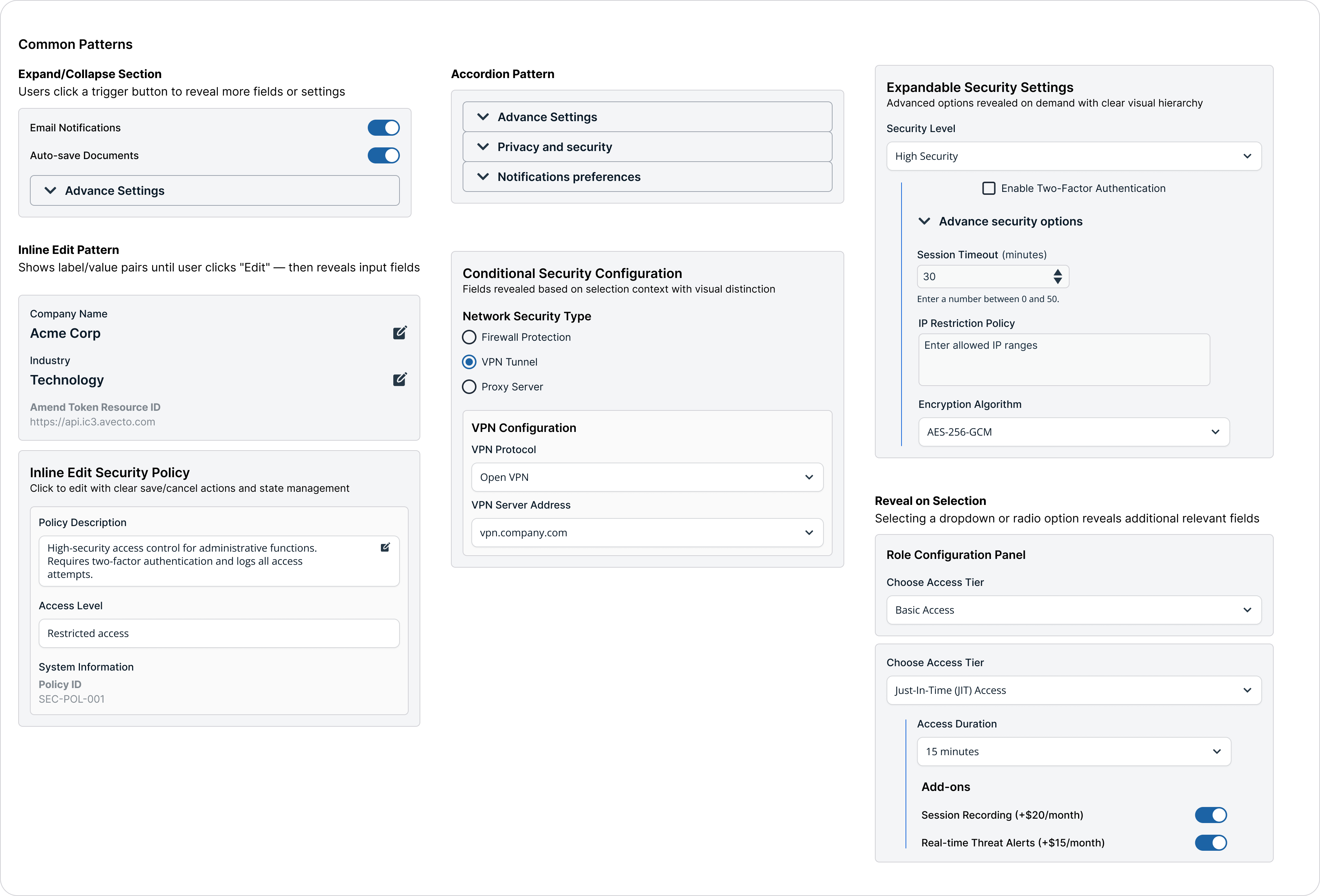
When to use it?
Use Progressive Disclosure when:
- You want to simplify complex forms (e.g., Settings, Configuration).
- There are optional or advanced fields (e.g., "Advanced search filters").
- You're showing summary → detail (e.g., card with expandable info).
- You want to guide users step-by-step without overwhelming them.
Visual Style Guidelines
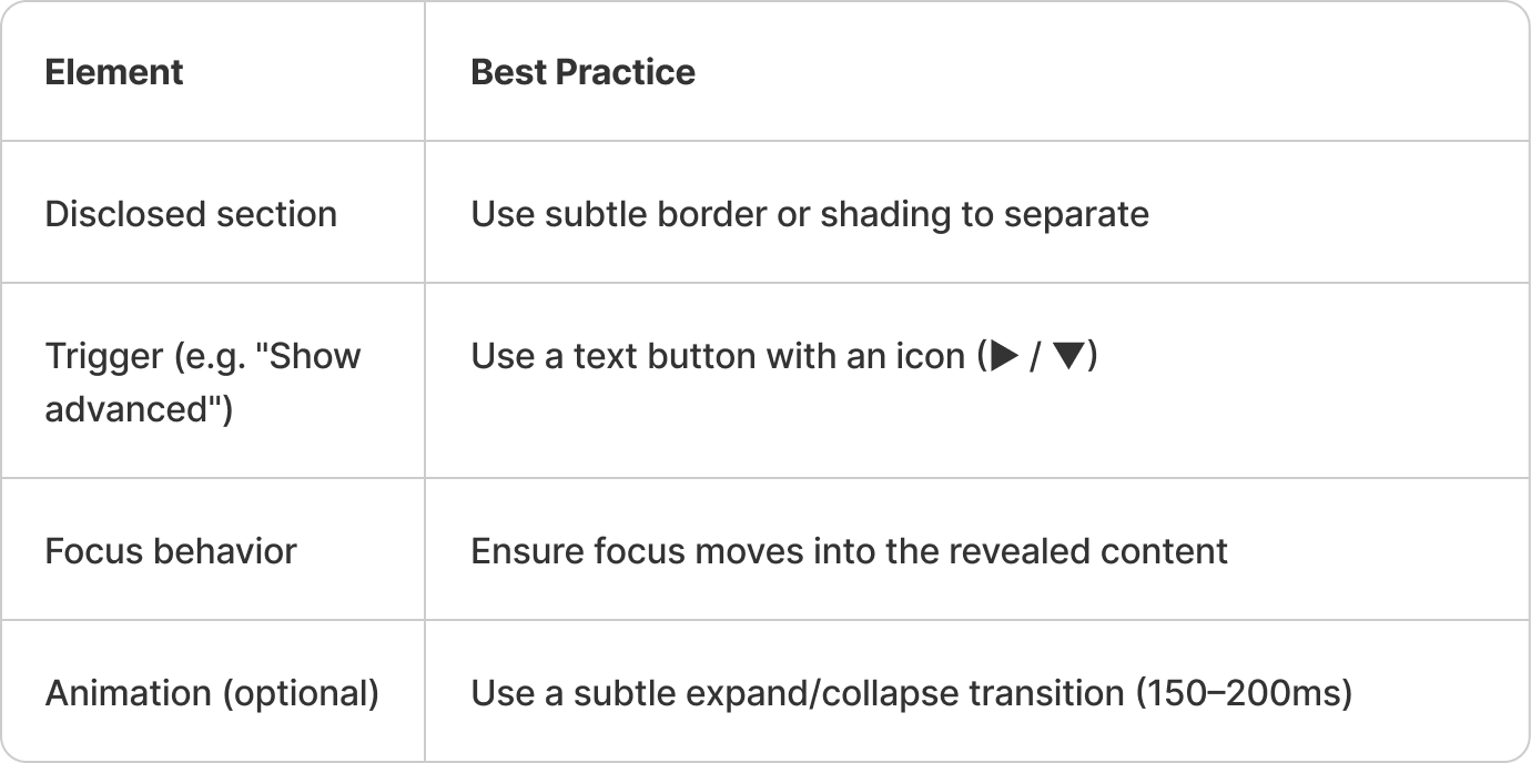
Do's and Don'ts
Do
- Use disclosure to simplify complex forms
- Label disclosure triggers clearly (e.g., "Show advanced")
- Animate expansion subtly
- Keep context when revealing information
- Start with essential information and reveal more on demand
- Use clear labels for expandable sections
- Provide visual indicators for expandable content
- Maintain context when revealing additional content
- Use smooth animations for expansion/collapse
Don't
- Hide essential fields behind toggles
- Use vague or unclear actions
- Jarringly insert large blocks of new UI
- Overwhelm users with too many disclosure levels
- Hide critical information behind multiple disclosure levels
- Use progressive disclosure for simple, short content
- Nest more than 3 levels of progressive disclosure
- Use it for sequential workflows (use steps instead)
- Forget to indicate expandable state in collapsed view
Variations & States
- Accordion patterns for content sections
- Expandable details within lists or cards
- Modal overlays for additional context
- Stepped workflows with optional details
- Collapsible sidebar sections
- Tooltip and popover information layers
Accessibility Guidelines
- Use proper ARIA expanded states for collapsible content
- Ensure keyboard navigation through expandable sections
- Provide clear visual indicators for expandable content
- Maintain focus management when content expands/collapses
- Use semantic markup for headings and sections
- Announce state changes to screen readers
Updated 4 months ago