
Typography
Overview
Typography is the style and appearance of text. It serves as both a functional and aesthetic tool, balancing readability with visual appeal. Consistent typography establishes patterns and hierarchy that help guide our users through products.
We use two font styles (Inter and Noto) to create a clear and cohesive hierarchy: one for headings and emphasis, and another for body text and supporting elements. Bold, clear, and purposeful typography is used to establish structure, guide users through content, and reinforce our brand identity.
Fonts (Typefaces)
Inter
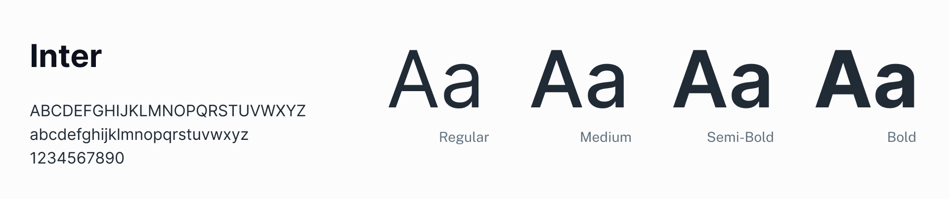
Use this typeface for all headings and titles.
Noto Sans
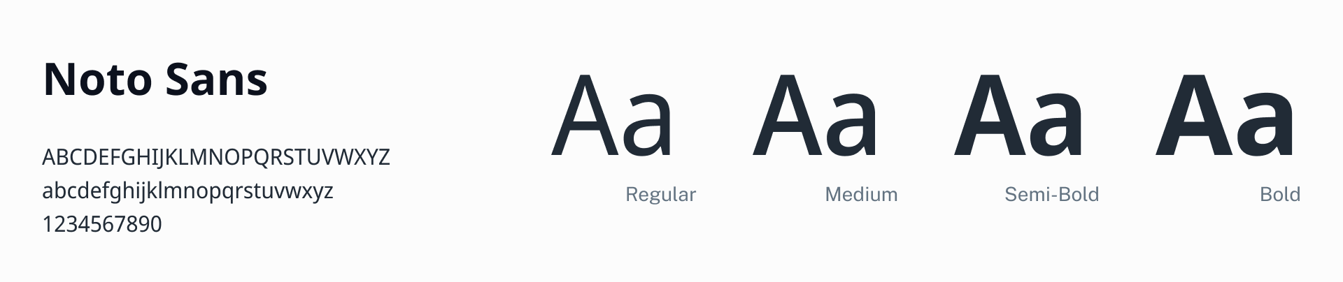
This font is used for the body and instructional text such as error text.
Fira Code
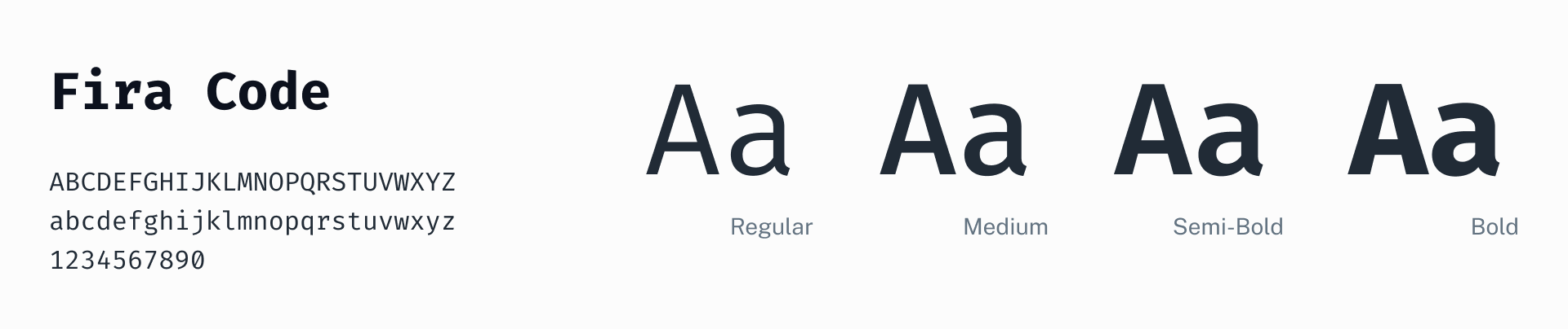
This is the font used for all monospace text and code samples.
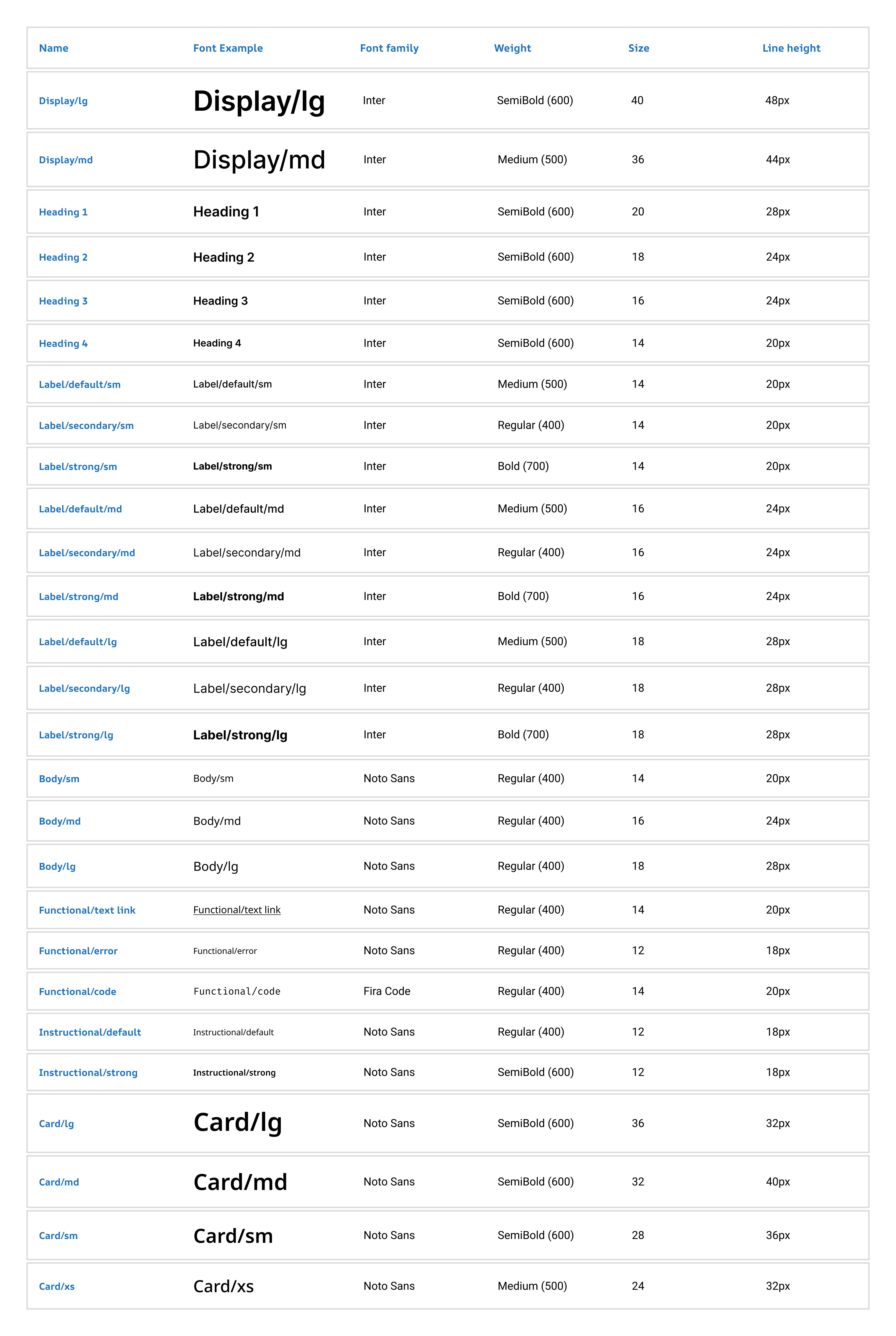
Typeramp (Font stack)
General
Font scale and weight work together to create hierarchy, larger font catches the eye first. Page title should always use Heading 1, font size 20px, this should be used for Page title only. We also have two larger font sizes to accommodate some legacy components which should not be used elsewhere. Anything smaller than 12px should not be used because it’s not accessible.
Weight refers to font boldness or thickness of characters in that typeface. We use semibold, bold, medium, and regular weight. We don’t use lightweight because it can be hard to read and often doesn’t meet accessibility standards.
These fonts should not be altered — no case or spacing changes like all caps. Text links are underlined and bold styling can be used sparingly in body text for emphasis, or to reference UI titles when writing instructions.
Heading
Headings establish a clear hierarchy within our interface. They guide users through the content structure, making it easier to scan and understand. The different levels of headings create a hierarchy of information. Smaller headings are subordinate to larger ones.
Avoid using more than three heading styles on the same page. When creating a heading, you also need to consider that it should be easy to scan. Use simple language. A good heading is a short sentence, without commas, periods, hyphens, or semicolons. These are intended for H1-H4 HTML tags on a page and follow a strict page hierarchy. For more information, go to page hierarchy.
Button
Buttons are critical interactive elements that guide users through tasks.
Use Inter font, 16px for button text to ensure readability. Maintain clear visual states (default, hover, pressed, and disabled) to provide feedback. Design buttons with distinct styles for hierarchy:
- Primary: For key actions (e.g. "Submit").
- Secondary: For less critical actions (e.g. "Cancel").
- Text button: For low-priority actions (e.g. "Learn More”).
Label
Labels are primarily used for HTML form elements and are styled with a medium weight to ensure clarity and distinction. In cases where labels are part of label/value pairs, a mix of weights is used: Bold weight is applied to emphasize labels, while regular weight is used for de-emphasized labels to allow the value to stand out more prominently. Medium-weight labels are still used as column headers to help them stand out from surrounding content and improve scan ability in data tables or lists. This approach ensures a flexible and intentional use of weights to emphasize or de-emphasize labels based on context.
Body
Use for all body copy that isn’t instructional, error or supporting text. Body text can be bold to emphasize certain words but use bold sparingly, so it does not conflict or compete with surrounding typography.
Instructional text
Instructional text is used to provide guidance, hints, or additional context to users and is styled with a regular weight to ensure it remains unobtrusive and easy to read. This is typically applied to text under text fields or elements that require supporting text. The regular weight ensures that the instructional text does not compete with primary content, maintaining a clear visual hierarchy.
Instructional text is also used in badges or other elements that require emphasis; a bold weight is used to ensure visibility and draw attention.
This balance between regular and bold weights ensures instructional text is styled appropriately to align with its purpose and context.
Error
Error text should be styled with a regular font weight.
Supporting Content
Use for the supplementary text that goes under labels on form controls, like the supporting content under checkboxes.
HTML tags and page hierarchy
General
A good page hierarchy and using semantic HTML tags play an important role in meeting accessibility requirements.
Do not skip levels of an H tag (having an H4 tag directly below an H2 tag, for example) as it confuses screen readers and breaks the hierarchy of a page.
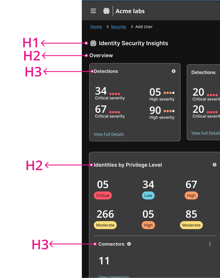
Example of page hierarchy (for H tag reference only).
Line length and alignment
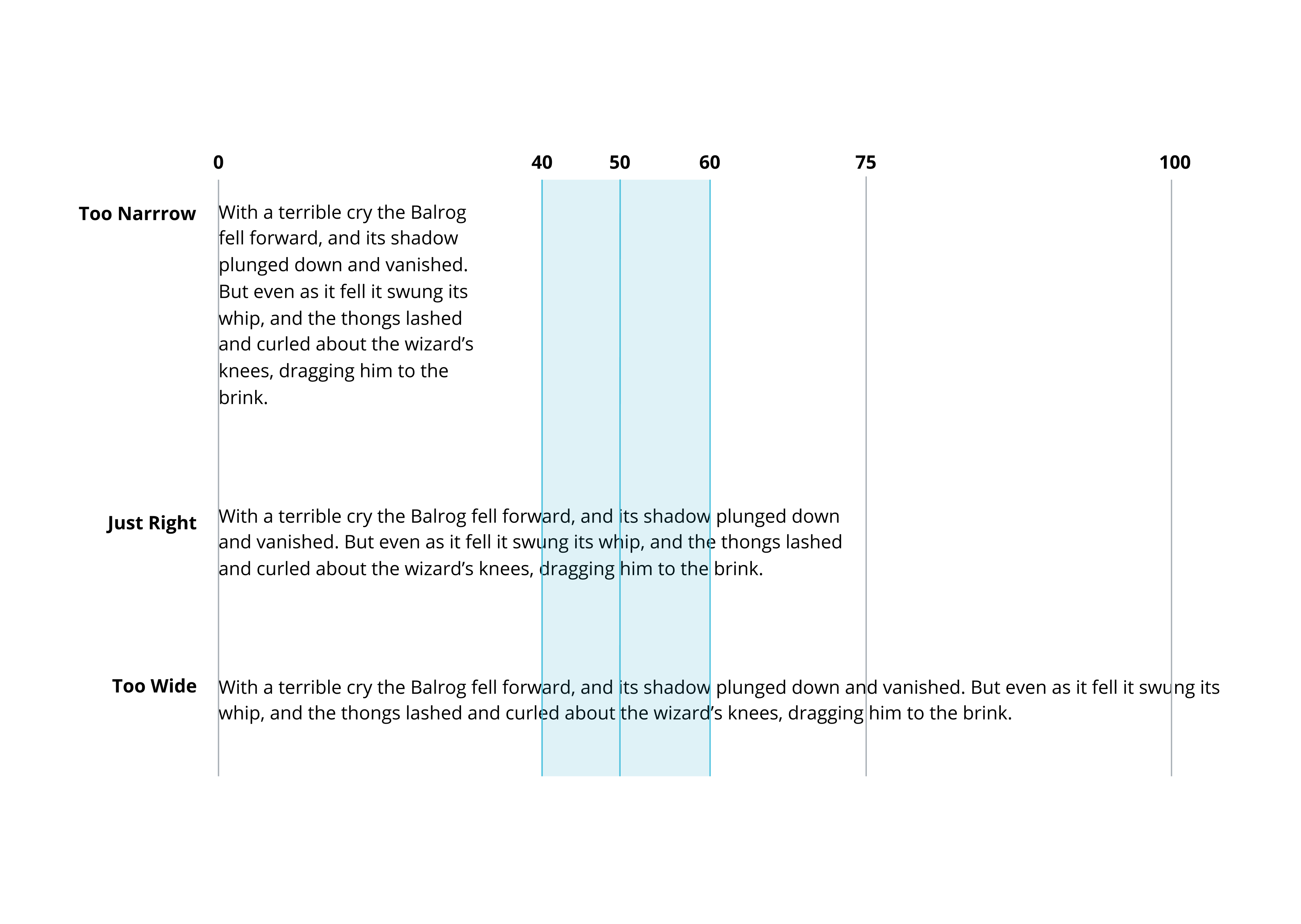
Line length is the number of characters on each line of text. Line length should be between 40 and 60 characters for body copy, and 20 and 50 for headings.
The baseline is the invisible horizontal line that text sits on. Use the baseline to align text with icons.
We do not justify text (when all the lines are the same length) because it isn’t accessible due to all the extra white space between words. This is confusing for screen readers.
Center-aligned text is not visually pleasing. Use left-aligned text, which works best for English and most languages.
Color and contrast
Color helps reinforce hierarchy. Using too many colors can create distraction.
Color can also be used to signal meaning. For example, error text can be red to signal that something has gone wrong, and text links are a different color to differentiate them from the surrounding words.
To keep content accessible, stick to a contrast ratio of at least 4.5:1 between the font and the background.
Resources
Usability & Web Accessibility: Headings
Yale University
Fira Code Font
tonsky, Github
Updated 7 months ago