
Breadcrumb
Overview
Breadcrumbs help users understand where they are in an application and allow them to move back up the hierarchical structure of the application.
Breadcrumbs are both wayfinding and navigation elements.
They are presented as text links reflecting the user’s current location and place in the application’s information hierarchy.
Other names: Breadcrumb Trail
Behaviors
Breadcrumb
Each breadcrumb represents a page in the application information hierarchy between Home on the far left and the current page on the far right.
Breadcrumbs are separated by a right-facing chevron.
All breadcrumbs, except the one representing the current page, are interactive and shown as text links. Each link takes the user to the page of the same name. These text links don’t use a “visited” text link styling. The breadcrumb indicating the current page is not interactive and is shown as normal body text.
Focus
Interactive breadcrumbs have the same hover and focus states as text links.
Usage guidelines
General
Breadcrumbs do not collapse, truncate or hide at any level.
Do use breadcrumbs
- To reflect the user’s current location in the application information hierarchy
Don’t use breadcrumbs
- To display the user’s navigation history through the application
- To show progress
Placement
Breadcrumbs appear below the navigation header and above the page title arranged left to right. The breadcrumbs are left-aligned and line up with the page title.
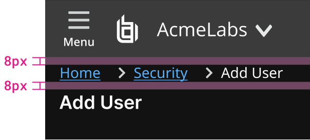
Example of spacing above and below breadcrumb.
Content guidelines
The home page of an application should be represented by a breadcrumb titled Home. All other breadcrumbs should have the same name as the page title they refer to.
Don’t include icons in breadcrumbs for decoration.
Interactive breadcrumbs use text link component functionality and styling. The rightmost breadcrumb is not interactive and has body text styling.

Example of spacing between breadcrumb sections.
Resources
Breadcrumbs: 11 Design Guidelines for Desktop and Mobile Page Laubheimer, NN/g Nielsen Norman Group
Related
Referenced in this section: Colors guidelines
Updated 8 days ago