
Checkbox
Overview
Checkboxes allow a user to select one or more options. Checkboxes inform users about the state of possible configurations and customizations.
Behaviors
Selected
Selected checkboxes have a checkmark that appears in its box. Selecting a checkbox or its label activates it to its selected state.
Focus
A focus state replaces the browser default state for checkboxes. The focus state surrounds the checkbox.
Disabled
Disabled checkboxes have a 50% opacity. Any combination of checkboxes in a group can be disabled.
Indeterminate (parent/child)
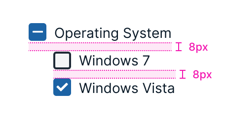
The indeterminate state is when a parent checkbox has a list of child checkboxes, some that are selected and some that aren't. Instead of a checkmark, a minus sign appears in this box if more than one—but not all—child checkboxes are selected.
Selecting or unselecting the indeterminate parent checkbox selects or unselects all its child checkboxes.
Grids use indeterminate checkboxes. The column header acts as the parent checkbox and the column options are the child checkboxes.
Example of indeterminate checkbox.
Variations
Default
A checkbox with accompanying text.
Supporting content
A checkbox with a label, as well as helper text below it. Used to provide more context to a checkbox option, like an email address paired with a name.
Tooltip
This checkbox gives users a tooltip when they hover over the question mark icon to the right of the checkbox label.
Single option
Single checkboxes are used to give a user a binary choice (checked or unchecked).
Multiple options
Multiple checkboxes allow a user to pick multiple options from a list of values.
Usage guidelines
General
Do:
- Use a logical method for organizing checkboxes, whether it's numerical, alphabetical, sequential or another clear, logical system.
- Use checkboxes for positive actions—like turning a feature on, not off.
Don't:
- Use checkboxes for actions that cause an immediate result. Use switches instead.
- Use a group of checkboxes for actions where only one selection is allowed. Use radio buttons instead.
Content guidelines
As with all short messages, be clear and concise when labelling checkboxes. Use words that users recognize. When checkboxes allow users to perform an action, start the label with a verb that makes the action and its effect clear to the user. Use sentence case for checkboxes.
Try this
- Keep me signed in
- Remember me
Not this
- Stay signed in
- Save My Login Details
When the checkboxes are items on a list, use nouns. Don't separate the checkboxes with commas or any other punctuation.
Try this
- Option One
- Option Two
- Option Three
Not this
- Option one,
- Option two,
- Option three,
For multiple checkboxes and parent checkboxes, use a specific title that summarizes all the options.
Try this
- Notification Preferences
Not this
- Preferences
Use the first person, especially when asking users for permission.
Try this
- I agree to the terms of service.
Not this
- You agree to the terms of service.
Checkboxes can have supporting content below the main label. This content may be long enough to wrap onto multiple lines but will fill its parent container before wrapping. This text should align with the label.
Positioning
Checkboxes are listed vertically, with each one on a new line. The checkbox's left side should be aligned with the other content in the parent container or page.
Parent/child indentation
Child checkboxes should be indented to line up with the leftmost edge of their parent checkbox's label.
Accessibility
Screen readers read checkboxes as "checked" and "unchecked." Even if the checkbox is labelled on the UI with text, checkboxes need labels in the code as well.
Related
Referenced in this section:
Components and patterns that use checkbox:
Updated 8 days ago