
Spacing
Overview
Padding is the space between elements on a UI. Spacing is the space between two containers in a layout. Together, padding and spacing help create clear, functional layouts.
Principles
Create relationships and hierarchy. Elements near each other are seen as being related. When more space is added between elements, their perceived relationship weakens. Elements with more spacing around them are usually seen as more important than elements that have less space around them.
Variance, but also consistency. Padding and spacing varies by interface, element, and relationship. For example, the spacing between two form fields is different than the spacing between a form field and a section title. There is no way to account for all the potential combinations, but following these guidelines ensures clarity and functionality across our products.
Basics & tools
4px grid
We use a base grid of 4px. Sometimes spacing inside a component needs to be a different number to make the overall component hit a desired size, but the spacing between items should nearly always be in increments of 4. Half spacing (2px) is used, but rarely.
Figma redlines
Redlines are the actual guides in Figma designs that communicate the exact padding and spacing specs.
Common spacing rules
Titles
- Titles are 20px from the top of a container.
- Content is typically 16px from both sides of its container. A notable exception is grids, which fill their container.
- Panels have at least 72px space between the title and the right icon, like the closing chevron or X.
- Titles for an entire page or panel have 16px below them, but these are not to be confused with section headings.
Section headings
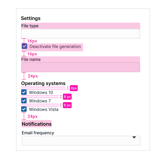
- Section headings are 24px below the previous sections they follow.
- Content under a section heading starts 8px below it.
Button spacing
- If a form has sections with buttons, the buttons are 16px below the last field in the section.
- Buttons at the bottom of forms that don’t move, known as docked buttons, have a top and bottom spacing of 8px.
- Buttons on modals or on panels that don’t belong to a form have 16px space between the bottom of the content and the buttons.
- Buttons have 8px spacing between other buttons.
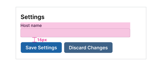
Section buttons have 16px above them.
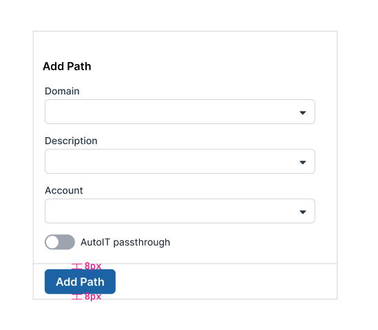
Docked buttons have 8px above and below them.
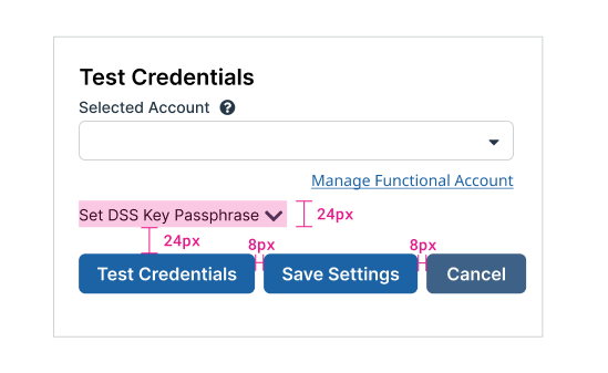
Panel buttons have 24px above them and 8px between them.
Text fields spacing
Use 16px space between text fields.
Other component spacing
Switches
- 16px between switches
Checkboxes
- 16px for single checkbox item
- 8px between multiple checkbox items
Combo box and drop-downs
- Minimum height of 48px for options in a drop-down or combo box
- 8px above and below the options in the list
Radio buttons
- 8px between typical radio buttons with no description
- 8px between descriptive radio button items in a group
- 16px between inline radio buttons in a group
- 16 points between radio buttons with description and a related or nested field
8px between typical checkboxes.
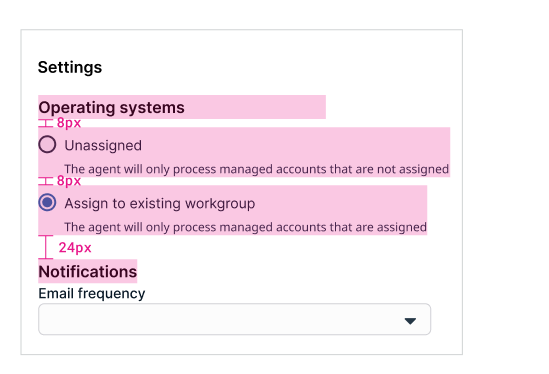
8px between radio buttons with instructional text and 16px between related or nested fields.
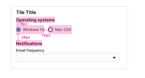
16px between inline radio buttons.
Panel spacing
Panels or cards have 8px spacing between them.
Page application spacing
Pages have 24px border around them before content begins — unless there’s a fixed left menu “stuck” on the left of the browser. If so, the content starts 24px to the right of the menu, as though there was still a 24px buffer on the entire page.
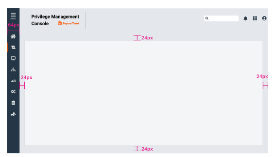
Spacing around page content.
Updated 4 months ago