
Colors
Overview
The use of color in an experience helps define communication, meaning, brand, and roles, making it easier for users to interact, search, and differentiate elements.
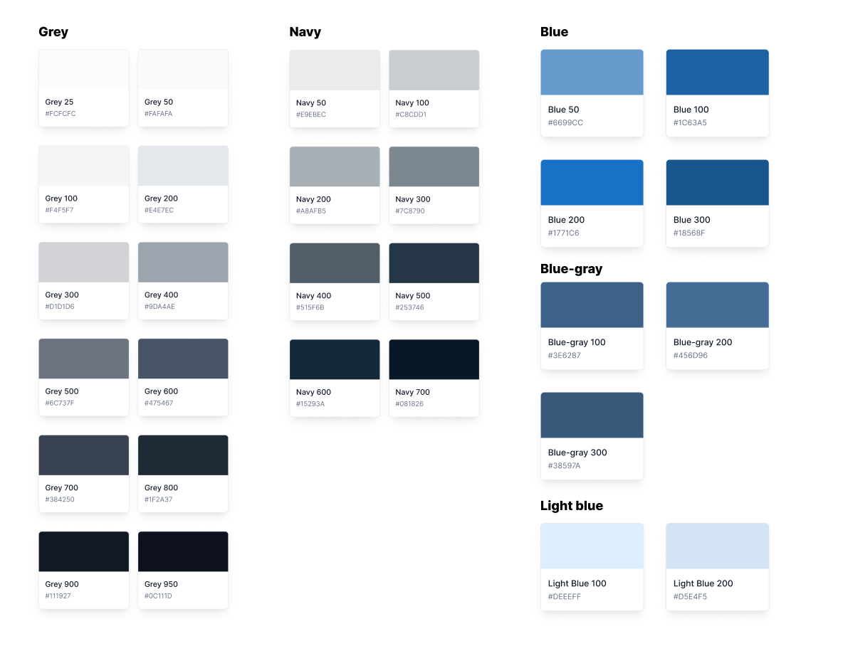
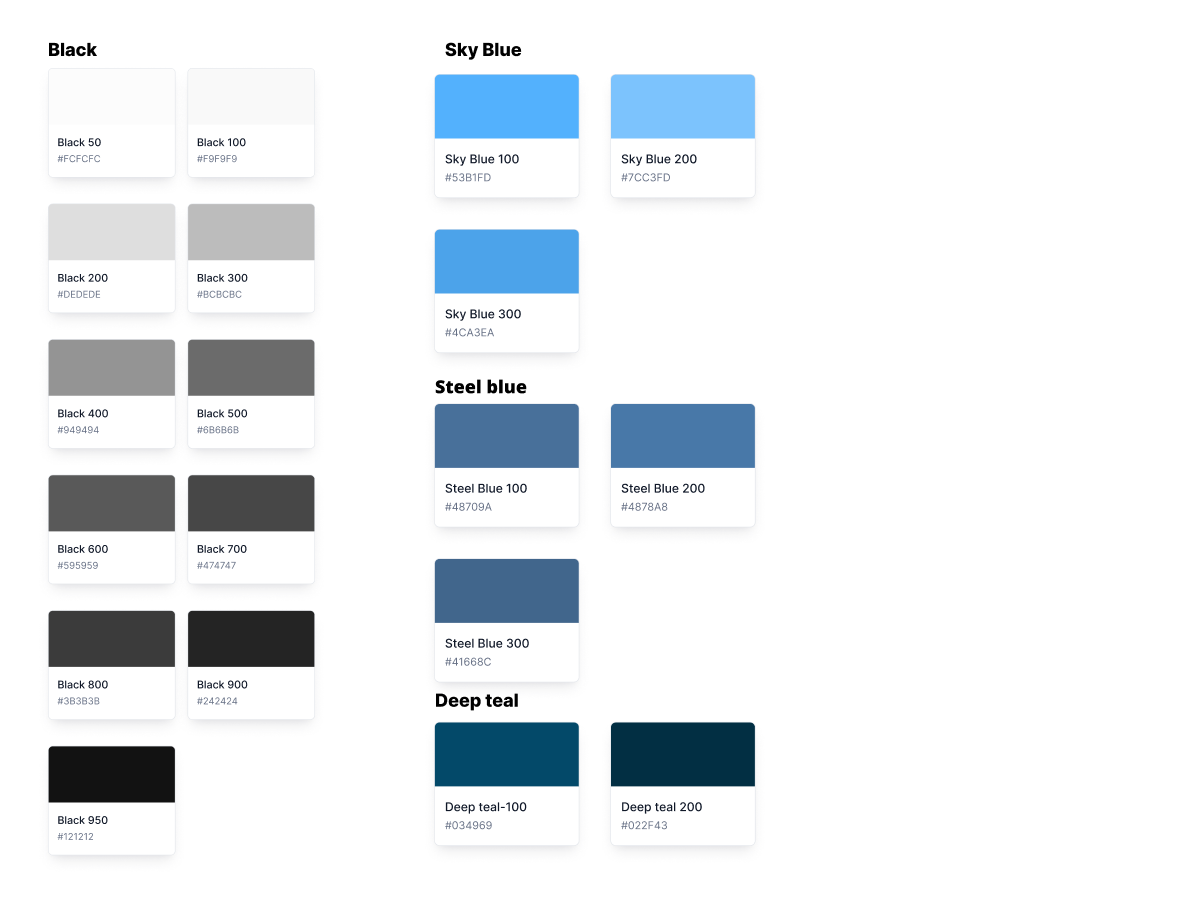
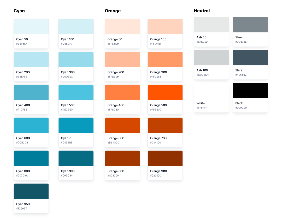
Our color palette is designed to be flexible enough to handle a variety of contexts—from digital interfaces to marketing materials—while maintaining a consistent brand feel. We focus on accessibility and scalability so that our product can be used by a wide audience in both light and dark modes.
Usage Guidelines
General
This color palette was designed to accommodate BeyondTrust’s vast range of products. The use cases are recommendations.
The guidelines on this page outline the general use of color. For color guidance related to specific components, visit the component-specific guidelines.
Light and Dark palette colors are not to be mixed and matched. Use light colors palette only for light mode and dark color palette only for dark mode.
Themes
The large majority of BeyondTrust's products provide both a light and dark color theme. Certain colors which may be suitable for the light theme may not translate well to the dark mode theme and vice versa. As such, appropriate alternatives must be provided where necessary.
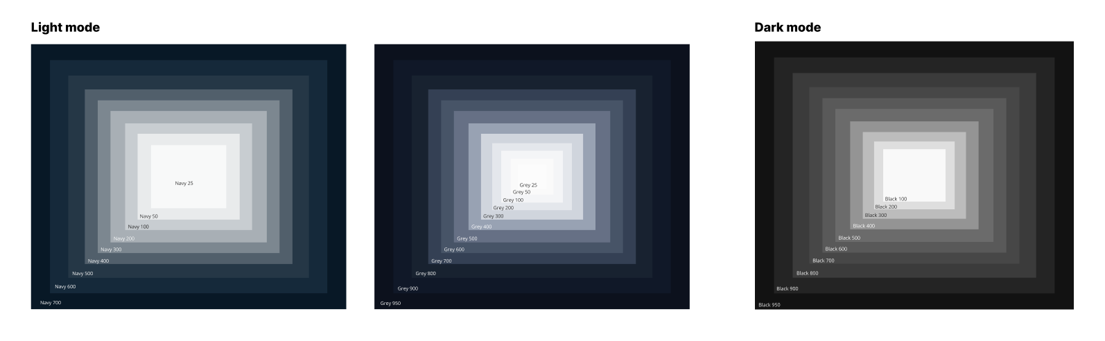
Light Theme
Dark Theme
Accent
Accent colors are used to emphasize and accentuate components in various states, such as the focus state of buttons.
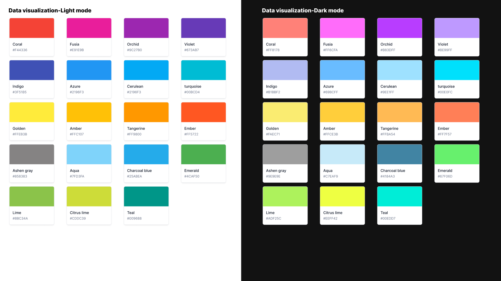
Data visualization
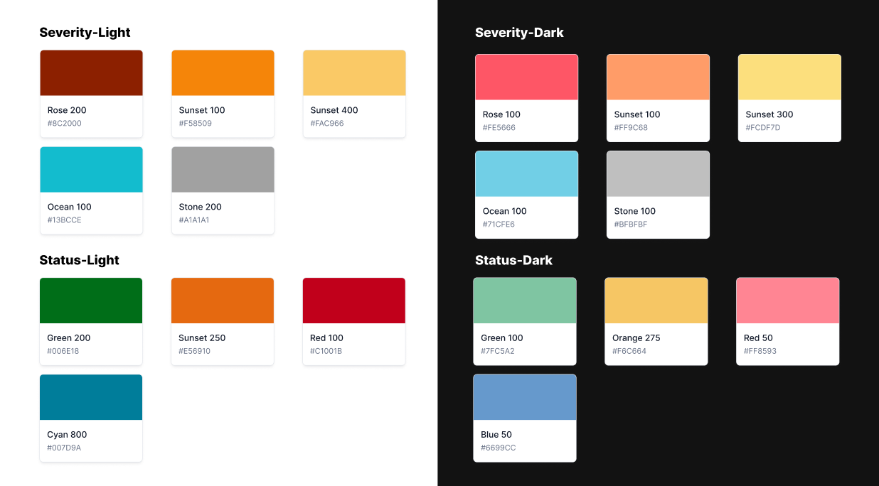
Severity and status
Accessibility
Accessibility considerations for color are very important: make sure your colors meet accessibility guidelines.
The two primary accessibility concerns are maintaining proper contrast ratios and making sure color is not used as the only method to define meaning in an experience.
Avoid relying solely on color to differentiate between objects, indicate interactivity, or communicate essential information. When you use color to convey information, be sure to provide the same information in alternative ways so people with color blindness or other visual impairments can understand it. For example, you can use labels or glyph shapes to identify objects or states.
WCAG Level AA compliant contrast ratios create a more accessible experience in our products. It ensures that our text, labels and controls are adequately legible, especially for sight impaired individuals.
WCAG 2.0 Level AA Contrast Requirements
- Normal Text must have a contrast ratio of at least 4.5:1
- Large Text must have a contrast ratio of at least 3:1
- Large text is defined as 14 point (typically 18.66px) and bold or larger, or 18 point (typically 24px) or larger.
- Graphics and UI Elements must have a contrast ratio of at least 3:1
Use the WebAIM Contrast Checker Tool to ensure the colors you are using are WCAG Level AA compliant.
Updated 7 months ago