
Tab
Figma | Storybook
Overview
Tabs allow users to navigate through related content. Use tabs to organize information within the same context.
Other names: Tabbed Interface, Tab Group, Tab Bar
Behaviors
Focus
A tab that's currently being focused on with a keyboard, or other accessibility tools that emulate keyboards.
Hover
A tab that's currently being hovered over with a mouse, or other accessibility tools that emulate a mouse.
Active
A tab that's currently selected. Also known as default.
Inactive
A tab that's not currently selected.
Error (active)
A tab that's selected that has an error in its content.
Error (inactive)
A tab that's not selected that has an error in its content.
Both active and inactive tabs in an error state should have an error icon. Once the error is corrected in a tab, remove that tab's error icon.
Within an active error tab, the first field with an error should be put in a focused state, allowing the user to start correcting it right away.
Required fields
If one or more of the tabs is a form with required fields, users should be able to switch between tabs without being prompted with a dialog box to save their work. What they've entered should save between navigating tabs.
Variations
Horizontal tabs
Horizontal tabs appear horizontally above the corresponding content. There’s no gap between the tabs and the content. Horizontal tabs always have a currently selected tab that has an indicator bar on top.
Use horizontal for smaller numbers of tabs. Try to be consistent with your approach — don’t mix and match horizontal and vertical for similar use cases.
Vertical tabs
Vertical tabs are stacked vertically to the left of the content. There’s typically a small gap between vertical tabs and the content. Vertical tabs always have a currently selected tab that has an indicator bar to the left.
Tab labels can wrap on vertical tabs, which increases the tab height.
Use the vertical variation when the number of tabs is larger. Try to be consistent with your approach — don’t mix and match horizontal and vertical for similar use cases.
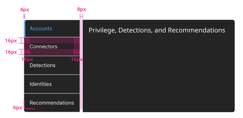
Example of a vertical tab with dimensions.
Usage guidelines
General
Do:
- Use tabs to display longer content that can be categorized.
- Use tabs for content that's similar but distinctly different, like a form and a data grid that are related.
- Display a single tab by default.
Don't:
- Use tabs as the primary navigation in an application.
- Use tabs to filter content that's the same—use button groups instead.
- Split content between tabs that a user needs to view at the same time.
Content guidelines
Tab labels should be descriptive nouns and should be short and scannable. 1-2 words maximum. Icons can be paired with a tab's label and should be arranged to the left of the text.
Position
Tabs can be used on full page layouts or in components such as modals, cards, or side panels.
Tab contents can be vertically scrollable if their length exceeds the screen. The tabs should remain fixed regardless of scrolling.
Accessibility
Each tab should have a unique title that differentiates it from the others. The title needs to be descriptive to help users with screen readers navigate the content.
Tabs or button groups
While tabs and button groups behave mostly the same, each has a specific use case.
Use tabs:
- To organize content that’s distinctly different.
- If your interface is particularly complex.
- For example, one tab contains a group of labels and values, another tab contains a data grid, and another contains a form.
Use button groups:
- To filter content that’s mostly the same.
- If your interface has the same or similar arrangements and components.
For example, each button displays a specific type of data in a grid.
Related
Referenced in this section:
Updated 8 days ago