
Data Grid
Overview
Data Grids let a user interact with tabular data and perform actions on that data.
Other names: Grid
Behaviors
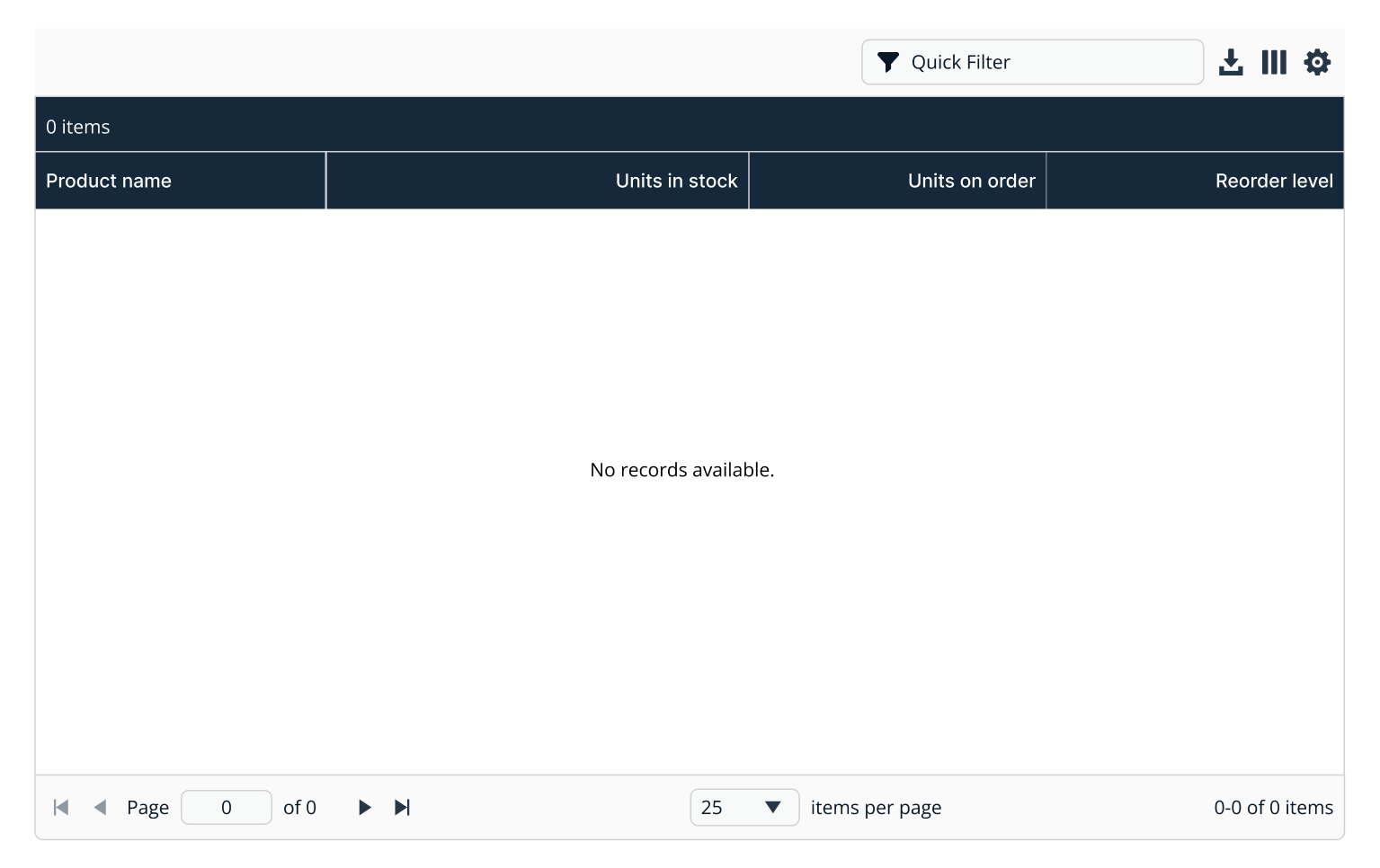
Empty state
A grid is in an empty state when there is no data to display, an error happens when loading the data, or a filter has no matching rows.
There’s a difference between a grid that’s still loading data and a grid that has no data to display.
A message in the middle of the grid notifies the user why the grid is empty. This can include a button to fix the problem, an icon to indicate there was an error, or just a brief message.
Minimum height for an empty state grid/table is dependent on the scenario. If vertical space permits the set height should be set to 400px.
Kendo UI has a template for empty states, but we should customize it.
Example of data grid in empty state.
Loading state
When data is loading a repeating progress indicator line appears directly above the grid header. This progress indicator is the full width of the grid.
Until the loading is done, all functionality is disabled. This includes filters, grid headers, and pagination. Once loading finishes the functionality is restored and the progress indicator disappears.
You can override Kendo’s default loading template with a progress indicator.
Row selection
On both single and multi-select grids, any area in a grid row that isn't used for an interactive element can toggle the row selection.
All rows in a Kendo multi-select grid are de-selected when a user clicks or taps anywhere in the row but the checkbox. That row is then selected instead.
On multi-select grids, users can also select the checkbox to the left of the first column or the indeterminate checkbox in the header. Indeterminate checkboxes are not checked or unchecked, but rather display a dash in the middle and control the selection of all rows.
Kendo guide on select-all checkbox.
Rows stay selected after a user performs an action. This applies to any number of rows across any number of pages.
Row actions
The last column in a grid is used for the actions for that row. If there are no additional actions besides viewing the details, an informational icon (i) is shown. If there are several row actions, a vertical ellipsis icon is shown and opens a menu of those actions.
Bulk actions
On multi-select grids that support bulk actions, a user can select one or more rows and the bulk action options appear above the grid header to the top left.
Grid actions
Grid actions appear in the top right of the component, above the header.
Filter
A grid filter is included in the actions by default. This might be removed in favor of using the larger filter pattern. On the user side, the filter can directly work on the data in the grid, but on the server-side the developer needs to reach back out to the server to perform filtering.
Refresh
When selected, refreshes the data in the grid.
Download
Users can download the grid data to a CSV file. Filters do not change the dataset downloaded — the whole data grid contents are downloaded. Like the grid filter, server-side downloads need to be activated from the server using the provided event emitters.
Column chooser
A drop-down appears when selecting the columns icon that lets users toggle column visibility. This should be kept linked to the current user so when they revisit the data grid it remembers their chosen columns.
Grid configuration
A menu appears that holds any extra options of the data grid, including the ability to switch back to the defaults for column positions, widths, and number of columns displayed.
Expand and collapse
If a row in the data grid has child rows, there’s a down chevron icon after the selected column.
This chevron expands a section below the current row that shows the child rows. At this point the chevron icon points up and selecting it again collapses the child rows.
Child rows have the same columns as their parent.
A border is used to divide the last child row from the parent row. Lines to the left of the child rows link back to the parent row to show the relationship between parent and child rows.
The total data grid row counts do not take child rows into consideration.
Kendo uses a plus and minus sign for expand and collapse by default. These should be changed to chevrons.
Item and selection counts
In the top left of the grid header is the count of items in the grid, followed by the number of selected rows. Single-select and multi-select data grids show this differently. If the data grid has child rows, keep in mind the item count doesn't include them.
Single-select data grids These grids only show the grid total until a row is selected. When a row is selected it changes to add (1 Selected) after the row count.
Example: 50 Items (1 Selected)
Multi-select data grids
Multi-select grids show the item total, the number of rows selected, and a text link that lets a user select all rows in the grid, not just the current page.
Example: 50 Items (4 Selected | Select all 50 items)
Exceptions
Exceptions are when the grid is in an error state or has no data, both single-select and multi-select grids show 0 Items.
Sorting
Clicking on a sortable column header begins (or reverses) the sorting on that column.
Columns sort ascending on first click, and a second click switches it to descending. A third click removes the sorting completely on that column.
The column titles appear as selectable when hovered over with the pointer cursor. If a sort is applied, a small up or down arrow appears next to the column title. If the arrow is up, the order is ascending, if the arrow is down, the order is descending.
Column resizing
Clicking and dragging a column header, if drag and drop is enabled, allows a user to drag that column to a new location. When the user drops the column header in the new position, this immediately changes the ordering of all data in the grid.
Column reordering
If drag and drop is enabled, dragging a column header allows a user to drag that column to a new location. When the user drops the column header in the new position, this immediately changes the ordering of all data in the grid.
Hidden columns
To help with smaller browser sizes and large numbers of columns, data grids should allow for the visibility of a column to be turned off – making it hidden. This list of hidable columns should appear in the data grid configuration above the grid header.
Only a limited number of columns should be visible by default – whatever makes sense for the dataset and product. The columns a user chooses to show should remain when they revisit the page.
Scrolling
Data grids fill their parent container but can also scroll vertically and, if it can't be avoided, horizontally.
Vertical
If there is even one row in a data grid, a vertical scrollbar is visible. This makes it easier for the header to be in alignment with the rows.
Horizontal
Horizontal scrollbars should be avoided whenever possible but can appear just above the pagination controls. This lets users see the columns that disappear off to the right of the visible data grid. Use sticky or locked columns.
Sticky and locked columns
Kendo has two features for "freezing" specific columns while scrolling — sticky and locked. They are the same concept but different code. Both options have the same functionality, except locked has certain limitations. Since there is nothing locked can do that sticky can't, use sticky columns for the majority of use cases — unless you’re certain locked is the correct approach.
Pagination
Every grid with at least one row of data has a pagination control at the bottom. The pagination is disabled until the grid has finished loading.
Disabled
Disabled grids have a 50% opacity. They cannot be clicked, focused, or interacted with in any way. This applies to the header, grid actions, and pagination too.
Variations
Single-select
The first data column has an empty column to the left of it to allow for a checkmark icon that shows which row is selected. This column doesn't have a header title.
If the grid is both single-select and there is only one row action, clicking on the row performs this action. This action is usually Show Details.
Multi-select
Grids that allow for multi-select show a checkbox in the selection column for individual rows, and an indeterminate checkbox in the header to select every row.
The grid header information in the top right always displays the number of selected rows and a text link that lets users select all rows in the grid.
Usage guidelines
Content guidelines
Column titles
Column header titles should briefly and accurately describe the column contents. They should be informative but scannable.
- Aim for a few words
- No more than 2 lines
- Never truncate
- Title case
- Include units of measurement, if applicable
Cell values
- Be concise
- Truncate longer values or wrap by no more than 2 lines (unless unavoidable)
- No cell should be empty. Cells without a value should show two hyphens --
Components in cells
Cells can also contain components:
- Buttons
- Checkboxes
- Icons (paired with text)
- Menus and vertical ellipsis menu icon
- Severity
- Tags
- Text Links
Try not to mix and match components in a single cell.
Icons Icons that don’t use color to indicate meaning, like product logos, can be a range of colors. There is a default icon color depending on light theme or dark theme.
Placement
Data grids extend to the edge of their parent container, ignoring padding and margins. However, there should be a gap between the bottom of the grid and the bottom of the browser or page.
Content order
Information should be organized in a logical, meaningful way, such as chronologically or alphabetically.
Cell alignment
In most cases the column title and column cells should share the same alignment.
Different rules exist based on types of value are in the cell:
Left-aligned:
- Text that is read left-to-right, like English. This includes text paired with icons.
- Numbers that are more abstract, like IP addresses and port numbers.
Right-aligned:
- Text that is read right-to-left, like Arabic. This includes text paired with icons.
- Numbers like counts, totals, and calculated values.
- Menu Icons.
Data grid or data table
Data grids and data tables have some overlap in features. Use a data grid when presenting datasets where row selections, row actions, or bulk actions are necessary. Data tables have more limited capabilities than data grids and should be used for read-only datasets where row actions or selections are not necessary.
Related
Referenced in this section:
Updated 4 days ago